
PatternFly 5.3.2
PatternFly 5.3.2 is now live! This was a patch release to fix a couple of bugs.
Promoted package versions
patternfly/patternfly (changelog)
patternfly/patternfly-react (changelog)
- @patternfly/react-charts@7.3.1
- @patternfly/react-code-editor@5.3.3
- @patternfly/react-core@5.3.3
- @patternfly/react-docs@6.3.3
- @patternfly/react-drag-drop@5.3.3
- @patternfly/react-icons@5.3.2
- @patternfly/react-styles@5.3.1
- @patternfly/react-table@5.3.3
- @patternfly/react-templates@1.0.3
- @patternfly/react-tokens@5.3.1
Fixed bugs
In this patch release, we:
- Fixed a wrapping issue in the bottom pagination component.
- Fixed and added accessibility support to the tree view component, including
aria-multiselectableandaria-selected.
PatternFly 5.3.1
PatternFly 5.3.1 is now live! This was a patch release to fix a bug.
Promoted package versions
- patternfly/patternfly-react (changelog)
Fixed bugs
In this patch release, we:
- Added
dist/dynamic-modules.jsonand made it easier for products to share specific dynamic modules.
PatternFly 5.3
PatternFly 5.3 is now live! Here are the highlights from this release.
Promoted package versions
- PatternFly extensions
React templates
We created a new feature for React components, called "templates", which combine a component with logic that supports a specific use case. Templates also come with a streamlined API that offers additional, limited customization. This will help reduce the amount of boilerplate code needed for common and recurring use cases.
Templates will also make it easier to upgrade your deprecated components going forward. For example, you can use a template to upgrade from the current version of our select component from the deprecated version.
Component updates
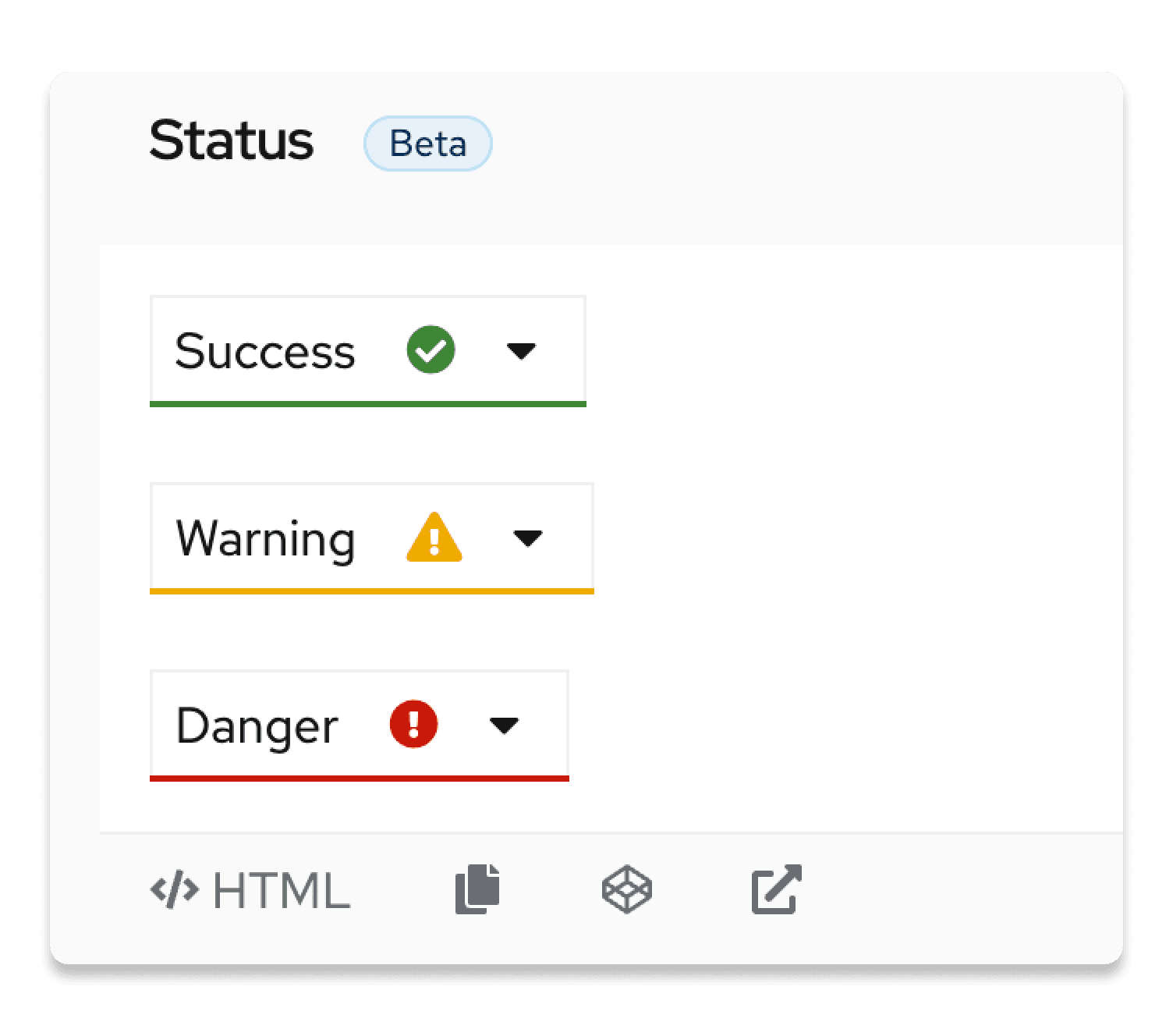
Menu toggle with status indicator
We added support for a status indicator within the menu toggle component. This allows you to associate a menu toggle item with different statuses, such as "success", "warning", and "danger", so that users have more context about the effect that a selection may have.
Because the select component is built with a menu toggle, this status indication can also be utilized by select components, as shown in this example. This update replicates functionality that was present in the now deprecated select component, which has not been supported in our current implementation until now. With this addition, you can now migrate any select components using validation to our updated select implementation.
Dual list selector "next" version
We created the "next" version of the dual list selector component, which offers a simpler, more composable implementation. We also updated all examples to be solely comprised of composable components.
Note: As a reminder, our next components will be promoted with our next major release. Once a next component is promoted, it becomes the default recommended implementation for that component.
Form select component bug fix
We found a bug in the form select component that occasionally rendered the wrong color for menu items when a select menu placeholder was used in certain OS/browser combinations. We corrected this issue, so the appropriate color will now be used consistently.
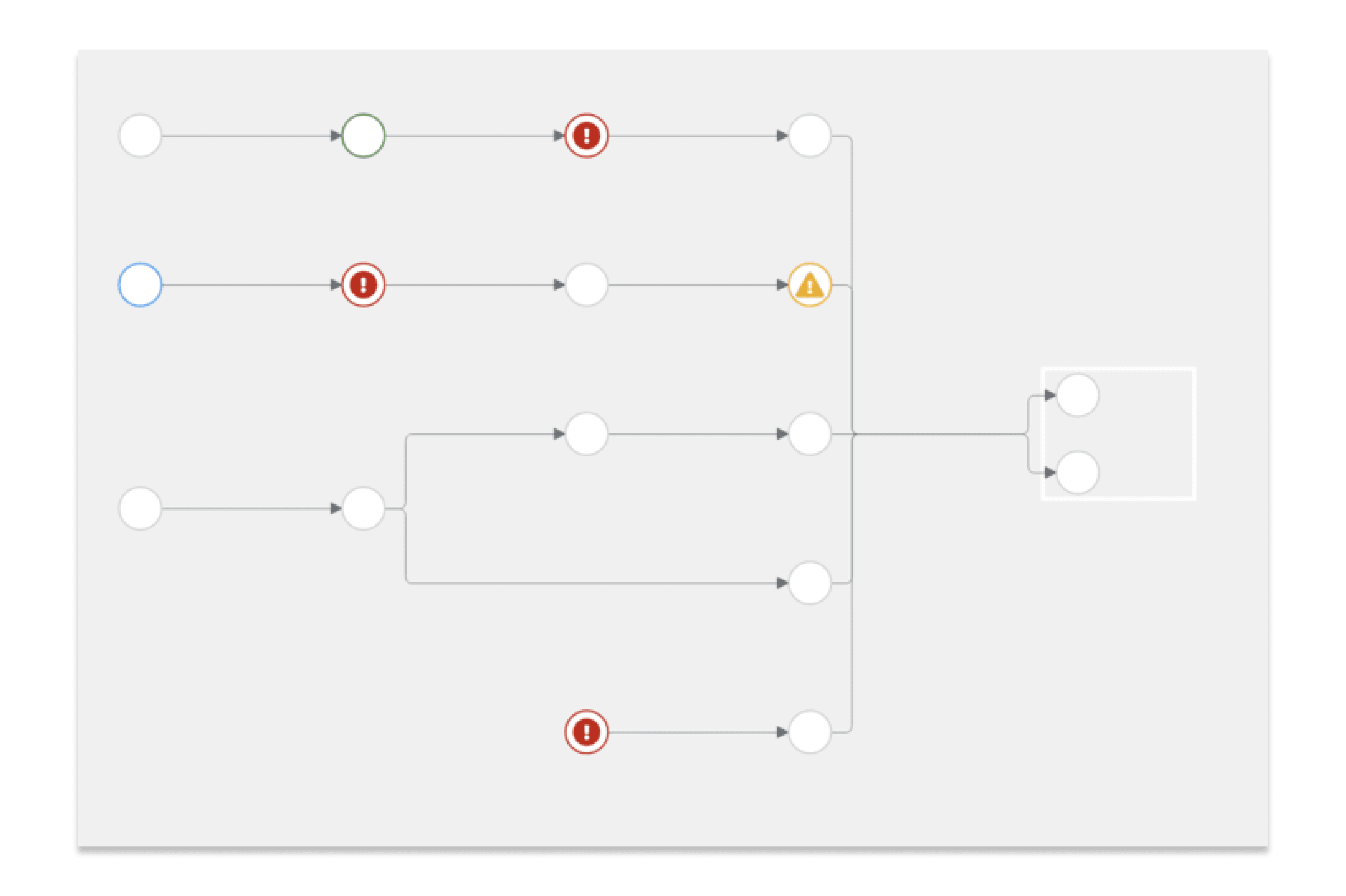
Topology pipeline updates
To enhance and improve the experience using topology pipelines, we added a few new features.
New layouts
We introduced a new vertical layout that can display pipelines from top to bottom, rather than the previous left-to-right default.
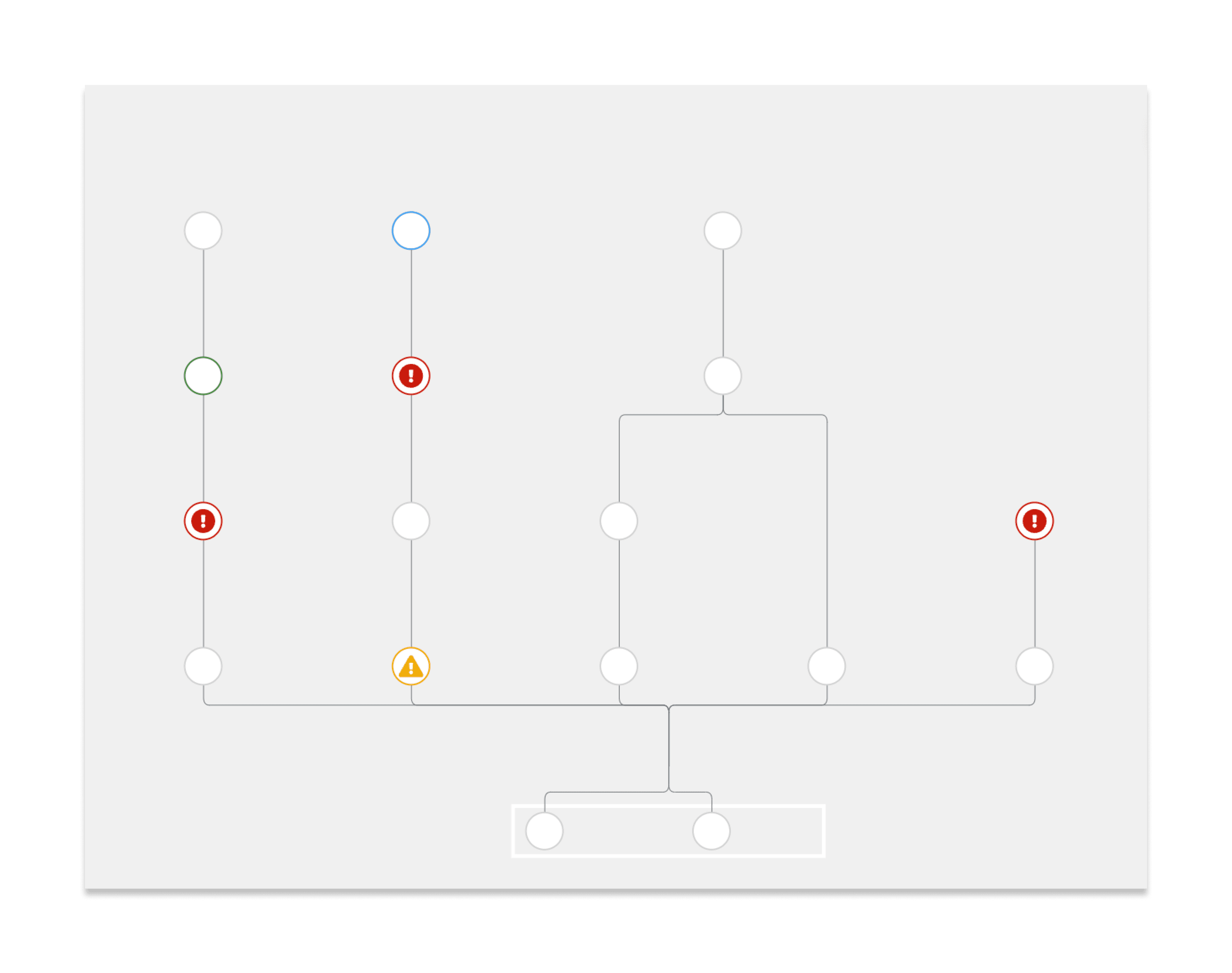
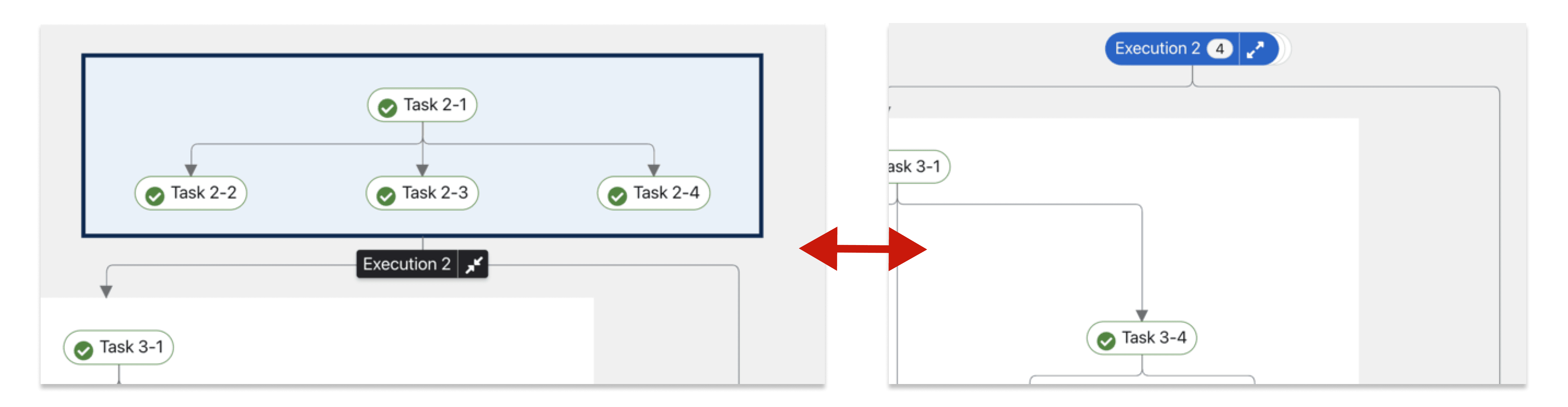
We also added support for groups in pipeline views, which allows you to combine and nest graphs. Groups are supported in both vertical and horizontal layouts.
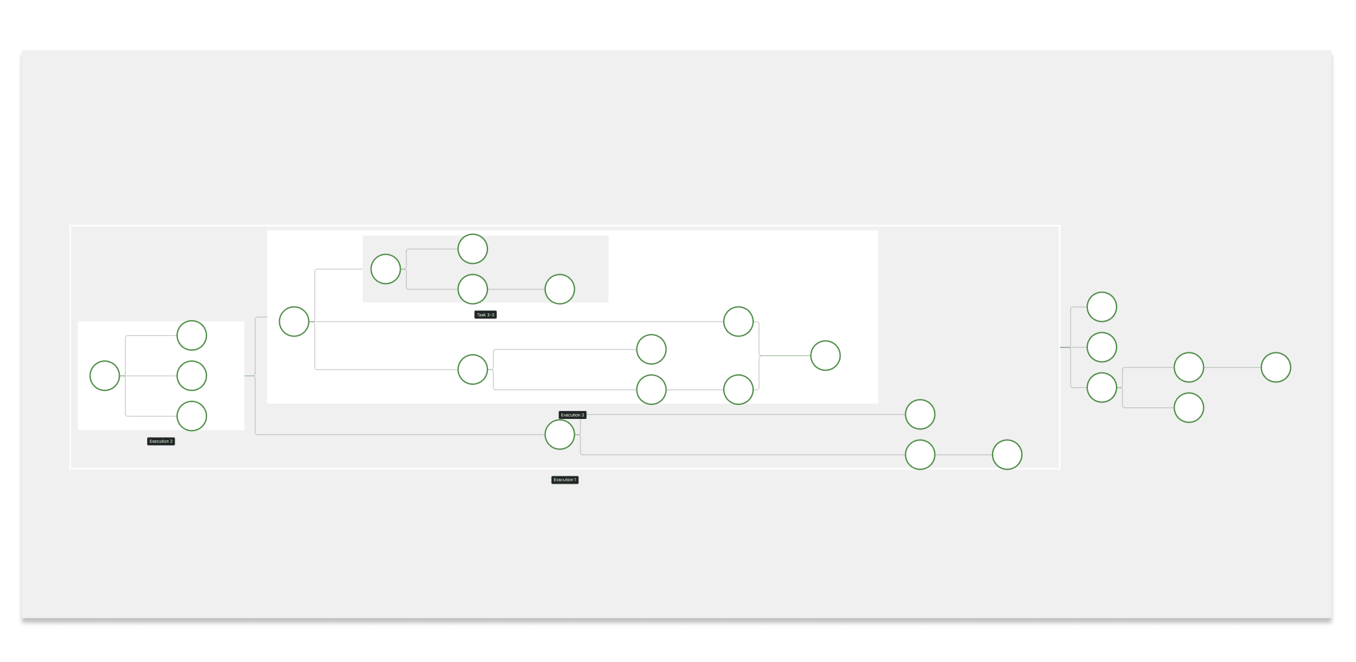
Functional and visual enhancements
To add more flexibility to topology pipelines, we added support for a couple of new features. These features introduce:
Arrows as directional indicators between pipeline tasks.
The ability to collapse and expand pipeline groups.
Quick starts extension updates
We made a few updates to our quick starts extension, which lives in the patternfly/patternfly-quickstarts repository.
Removed AsciiDoc code
To clean up our codebase and processes, we removed AsciiDoc examples, which were no longer being utilized by any products. We still have support for AsciiDoc, but we generally recommend using Markdown instead.
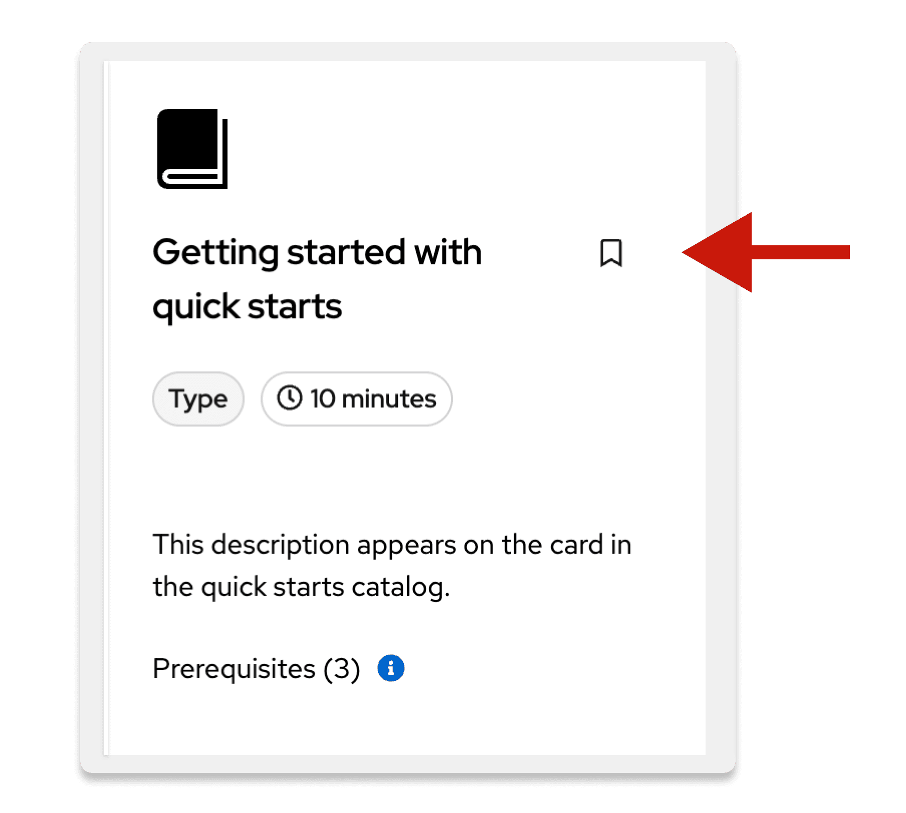
New bookmarks feature
We added new functionality to cards in quick starts, which allows users to bookmark cards as needed.
Bug fixes
We fixed a few issues to enable:
- Clickable cards.
- Active and hover card styles.
- Links that open in a new tab.
Coming soon
The release of our v6 alpha will be here soon. Keep an eye on our Medium publication and the PatternFly website for updates. We'll be sure to share an announcement as soon as the alpha is live!
PatternFly 5.2.2
PatternFly 5.2.2 is now live! This was a patch release to fix a significant bug that was found.
Promoted package versions
- patternfly/patternfly-react (changelog)
Fixed bugs
In this patch release, we:
- Corrected an issue that caused our menu component to crash when dynamically resetting menu items.
PatternFly 5.2.1
PatternFly 5.2.1 is now live! This was a patch release to fix a few bugs that were found.
Promoted package versions
Fixed bugs
In this patch release, we:
- Corrected issues with styles and intractability of cards in Chromium-based browsers.
- Additional details: https://github.com/orgs/patternfly/discussions/6381
- Added support for status modifiers on modal titles.
- Updated types used in react-charts to reflect changes in the Victory types.
- Reverted a previous type change within our clipboard copy component that was unintentionally breaking.
- Updated our code editor component to pass through more props to monaco-editor.
PatternFly 5.2
PatternFly 5.2 is now live! Here are the highlights from this release.
Promoted package versions
- patternfly/patternfly (changelog)
- patternfly/patternfly-react (changelog)
- PatternFly extensions
Note for ConsoleDot applications
PatternFly's 5.2 release is incompatible with @redhat-cloud-services/tsc-transform-imports@1.0.6 or earlier.
If your application has a dependency on @redhat-cloud-services/tsc-transform-imports, be sure to update it to @redhat-cloud-services/tsc-transform-imports@1.0.7 or greater.
Component groups extension
We released a new extension, called component groups. This extension contains a range of React components that are more complex than standard PatternFly components. These component groups combine and adjust multiple base components to provide opinionated solutions for recurring use cases across products using PatternFly.
Note that the component groups extension is contained in its own GitHub repository.
This extension was created in an effort to migrate components from the Red Hat Insights shared components repository. The PatternFly component groups extension is now recommended to be used in place of the RedHat Insights implementation. To update your product to using the component groups extension, refer to our migration guide.
The latest version of component groups contains the following components, with full documentation on PatternFly.org:
- Ansible
- Battery
- DetailsPage (beta)
- Error boundary
- Error state
- Invalid object
- Not authorized
- Skeleton table
- Tag count
- Unavailable content
- Warning modal
To learn more about the story behind this project, read our Medium article.
We plan to continue to add additional components as they are requested, so please get involved if you have feedback or new ideas!
New React "next" components
As a reminder, our next components will be promoted with our next major release. Once a next component is promoted, it becomes the default recommended implementation for that component.
We introduced a next version of modal. With this change, the modal API will be composable, rather than React property based.
We also introduced a next version of drag and drop with related demos.
Topology updates
New additions
We added a new hulledOutline property in DefaultGroup, which can be used to specify if a group's outline is hulled or rect.
We added logic to hide tags when the detail level is low, since they were difficult to read. Hidden tags will reappear if you hover on an edge, as you zoom in, or if you view the screen in a larger format.
Fixes
We removed the use of window and global to resolve bundling issues.
We updated the method in which we get node details to better support lower scales. Now, we get the topology details level directly from the graph, instead of through the useDetailsLevel hook.
Accessibility guideline updates
We updated all of our top-level accessibility guidelines for better clarity and organization. As part of these updates, we also added a new page called Design for accessibility, which documents accessibility considerations for visual designers.
The following pages now have updated content -- take a read!
- About accessibility (formerly named "Accessibility fundamentals")
- Accessibility scorecard
- Design for accessibility (new!)
- Develop for accessibility (formerly named "Product development guide")
- PatternFly's accessibility
- Testing your accessibility
Coming soon
The next major version of PatternFly (v6) doesn't come out until later this year, but our team has started preparing for the release, which will include new theming capabilities and design token support.
Keep an eye out for more information about the v6 alpha release , which is slotted for Q1 2024.
PatternFly 5.1
As part of our quarterly release cadence, we're excited to announce that PatternFly 5.1 is now live.
To help provide a high-level view of what's new, we've pulled together the major highlights from this release. Keep reading to learn more!
Promoted package versions
- patternfly/patternfly (changelog)
- patternfly/patternfly-react (changelog)
- PatternFly extensions
Right-to-left language support
Last quarter, our developers were dedicated to implementing right-to-left (RTL) language support in PatternFly. To better enable product internationalization, we've updated our components to support both right-to-left (RTL) and left-to-right (LTR) languages. You can check out our RTL handbook for more details and resources.
To achieve this support, our components now use logical properties (like block-start, inline-end, block-end, and inline-start), which will ensure that styles are laid out properly, no matter which languages you're using.
Note that, to avoid a sweeping breaking change, PatternFly variable names still use "top", "bottom", "left", and "right".
New topology documentation
We updated the control bar documentation for topology to clarify the extent of the control bar functions. This addition highlights information that will better support the range of control bar use cases.
Clickable labels
We added a new "clickable" variant to the label component, so that you can use a label that acts as a button.
To enable this behavior, we've added a new onClick property to the <Label> component, which can contain an action fit for your use case.
Note that you cannot use onClick if the href or isEditable properties are already passed into <Label>, since those align with link labels and editable labels, respectively.
PatternFly 5.0
Refer to our upgrade guide to update from PatternFly 4 to PatternFly 5.
Promoted package versions
- patternfly/patternfly (changelog)
- patternfly/patternfly-react (changelog)
- PatternFly extensions
- @patternfly/react-catalog-view-extension@5.0.0 (changelog)
- @patternfly/react-console@5.0.0 (changelog)
- @patternfly/react-log-viewer@5.0.0 (changelog)
- @patternfly/react-topology@5.0.0 (changelog)
- @patternfly/react-user-feedback@5.0.0 (changelog)
- @patternfly/react-virtualized-extension@5.0.0 (changelog)
- @patternfly/quickstarts@5.0.0 (changelog)
Dark theme support
While PatternFly has supported a dark theme in beta for some time, our dark theme has not been fully documented or tested. As part of the release of PatternFly 5, we were dedicated to thoroughly testing our beta implementation to ensure that it was ready for everyone. With this major release, we're excited to say that PatternFly's dark theme is fully vetted and supported. You can configure your applications' dark theme to update based on users’ system preferences.
We are also currently working on introducing more robust theming capabilities in a future PatternFly major release. Going forward, all future themes will include a light and dark theme.
To enable dark theme in your products, add the .pf-theme-dark class to the <html> element.
For information regarding the shipping and implementation processes for dark theme, as well as general advice for its use read our dark theme handbook.
React 18 support
We are committed to supporting the 2 most recent versions of React for PatternFly to keep up with the environments that our users work in. To this end, we are pleased to announce that PatternFly 5 is compatible with both React 17 and React 18.
Versioned CSS variables and class names
We wanted to ensure that our variable naming conventions were clear and consistent going forward with our future release cycles. To keep things organized and clear, we updated our CSS variables and class names so that they are explicitly associated with the version of PatternFly that they align to. For PatternFly 5, we added a prefix of v5 to a number of our variable and class names.
For more details, refer to our upgrade guide and our updated CSS classes and variables documentation.
Event handler parameter consistency updates
Previously, our event handler parameters weren’t consistently ordered. To meet industry standards, and get everything on the same page, we added event parameters to all of our callbacks and reordered handlers to consistently list the event as the first parameter. Additionally, we made sure that all of our event handlers now pass back an event. This change will make it easier to incorporate third party libraries, especially in the case of form building tools, like Formik.
Our codemods should take care of most of these changes, but if your callback function is defined at the class level you will need to manually update your code.
Changes to React icons
To improve the consistency of icon usage across projects adopting PatternFly, we are no longer using inline styles, color, or size for icons. Instead, React icons come with a built-in class pf-v5-svg, which gives an icon a default height, width, and vertical alignment. An icon's color is now set on the SVG file itself, using the fill attribute.
If you want a custom color or size, wrap your icon in the <Icon> React component, which comes with colors, size, etc. If you had used noVerticalAlign on your icon in PatternFly 4, you can achieve this same style by using wrapping your icon in the <Icon> React component and passing in the isInline prop.
If you are not importing @patternfly/react-styles, but are still using @patternfly/react-icons you will need to provide the generic styles that you have separated from the icons and moved into @patternfly/react-styles. For more information, refer to the @patternfly/react-icons README file.
Major component updates and enhancements
Card
The following updates were made to the card component to improve the experience for both developers and end-users.
Card header
Our previous card API was difficult to understand and utilize. We reconfigured its markup and React subcomponents so you can implement cards more easily.
As a result, CardHeaderMain and CardActions are no longer exported from PatternFly, and are instead rendered internally within the CardHeader sub-component. Any content and properties for CardHeaderMain or CardActions should be passed directly to CardHeader instead.
Clickable and selectable cards
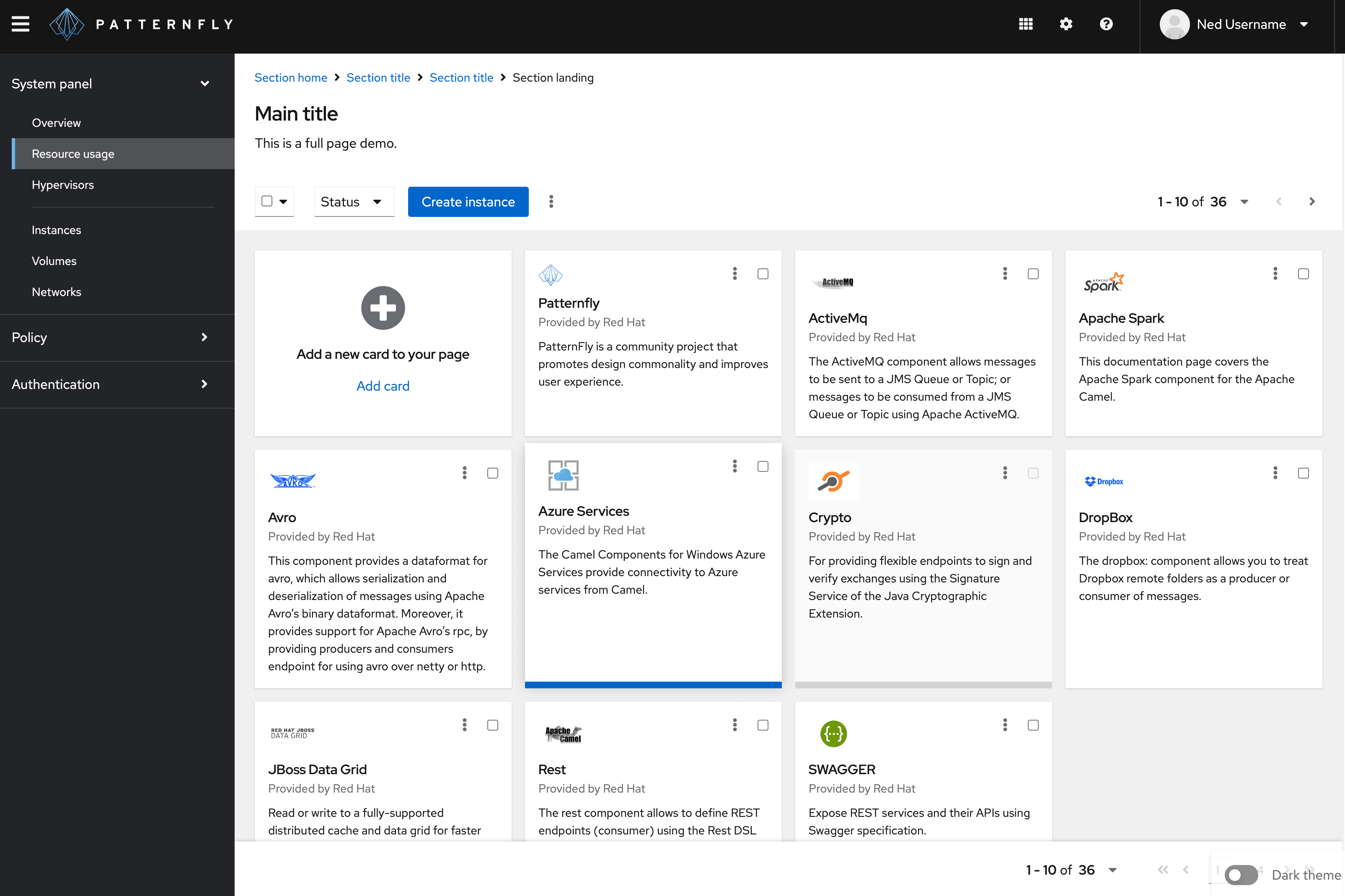
Clickable and selectable cards have been redesigned to improve usability and accessibility.
With our previous implementation of cards, screen readers were unable to determine when a card was clickable or selectable. Similarly, users navigating without a screen reader would still have to mouse over a card to determine when it was clickable or selectable. We weren’t satisfied with these hurdles.
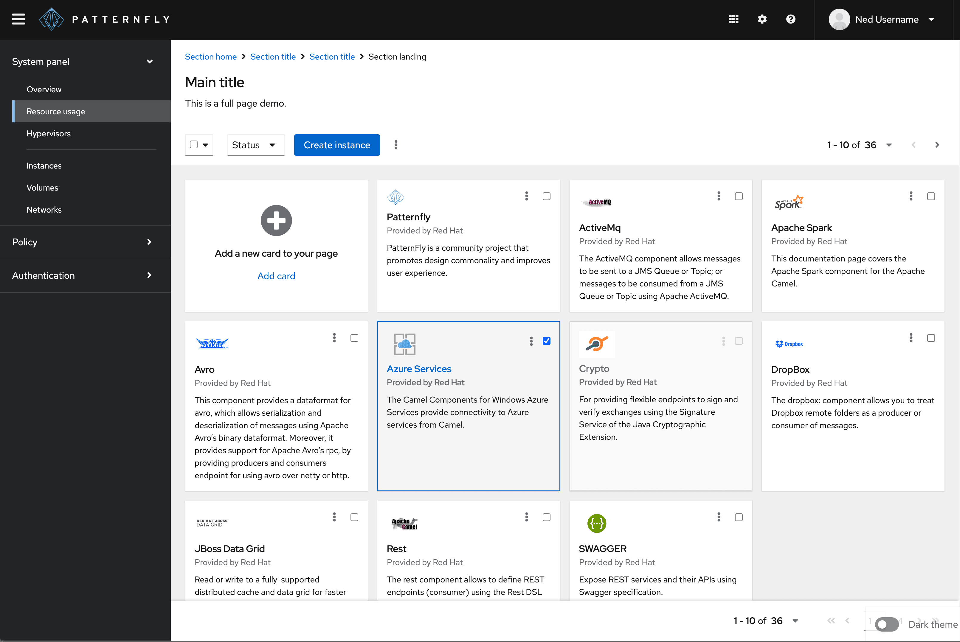
To improve accessibility and usability for both keyboard and screen reader users, our new selectable and clickable cards are redesigned to help users determine when a card can be selected.
Our previous design styled selected cards with a colored underline:
Our new design styles selected cards with a colored outline and darkened background color:
As a result, our previous design has been deprecated, along with the following properties:
isSelectableRaisedisDisabledRaisedhasSelectableInputselectableInputAriaLabelonSelectableInputChange
We recommend that you upgrade to these new cards if your use case calls for them. You can read more about their intended usage in our card documentation.
Empty state
Our empty state component was long overdue for some clean up. It was not following PatternFly’s established practices for CSS rule specificity and CSS variable usage. We also saw a great opportunity to improve our empty state layouts by using CSS gap.
To freshen things up, we made a number of changes, which can be seen in action over in our empty state documentation. These changes include the following:
We replaced the
EmptyStatePrimaryandEmptyStateSecondaryActionscomponents withEmptyStateActions.We added the
EmptyStateHeadercomponent. ToEmptyStateHeaderyou should pass anEmptyStateIconto theiconproperty, a main title totitleTextproperty, and (optionally) a title's heading level to theheadingLevelproperty.We added the
EmptyStateFootercomponent that wraps any content followingEmptyStateBody.
Helper text
Our components often allow you to display descriptive or status text below a form field to help users make decisions, but the implementation of this text hasn’t been consistent across components. We wanted to clean things up so that this implementation is more consistent.
As a result, a few components were updated to use the same HelperText component, rather than their own disparate helper-text-like implementation. This change affects the following components:
The
FormGroupcomponent is especially affected, as we've removed the following helper text related properties in PatternFly 5:helperTexthelperTextInvalidvalidatedhelperTextIconhelperTextInvalidIconisHelperTextBeforeFieldTo add helper text to a form group in place of these properties you should use the
FormHelperText,HelperText, andHelperTextItemcomponents directly as part of theFormGroup’s children. This implementation is shown in PatternFly's invalid form example.
Input group
Previously, the input group styles were too narrowly coupled with the types of children they contained. It did not match the approach we took to styling other groups of components. This update enabled more flexibility for the types of children allowed in an input group, and simplified the style rules for things like spacing, focus management, and item size manipulation.
As a result, input group items no longer automatically fill the available space of their container. To retain previous styling, new InputGroupItem components may need to have the isFill, isBox, and/or isPlain properties adjusted. This is likely necessary for FormSelect, TextInput, Select, and TextArea, which may particularly require the isFill property to be passed to InputGroupItem.
Refactored and deprecated components
As PatternFly has matured, a number of its popular components have been repeatedly enhanced. Their complexity and fragility has grown to become an ever-growing maintenance problem. Rather than continuing to enhance these delicate components, as part of PatternFly 5, we have adjusted our implementation and recommendations to support new components that are more flexible, composable, and easier to maintain. As a result, we are deprecating our previous implementations in favor of our newer, more composable components.
The following table outlines the components that are affected, as well as the component(s) that we recommend using as a replacement.
Deprecated component | Recommended replacement |
|---|---|
Note: To understand how our new composable menus can be used to replace deprecated components, view our custom menus examples.
Deprecated components are no longer being maintained or enhanced, but they will remain in our codebase at least until the next major release.
You can still continue to use deprecated component implementations by importing them from @patternfly/react-core/deprecated or @patternfly/react-table/deprecated, but we recommend aligning with their replacements to benefit from our code enhancements and better prepare for future iterations.
Components promoted out of beta
Whenever a new component or major component enhancement is introduced to PatternFly, it’s released in beta until it’s been vetted by products and proven to be stable enough. While components are in beta, they may continue to evolve as we tweak their API and modify their HTML markup. Once a component is promoted out of beta, we are committed to withhold any additional breaking changes to the component until our next major release. With PatternFly 5, we’re excited to promote 16 components and variants out of beta:
- Charts with patterns
- Date picker
- Dropdown-next (our new recommendation for dropdown)
- Icon
- Log viewer extension
- Progress stepper
- Progress with helper text
- Search input
- Select-next (our new recommendation for select)
- Tabs variants:
- Text input group
- Tile
- Truncate
- Wizard-next (our new recommendation for wizard)
Extensions updates
All PatternFly extensions have been updated to be compatible with PatternFly 5. For details on the nature of the changes made to each extension, please see the PatternFly 5 release notes. Most notably, topology's D3 dependency has been updated to version 7, and some event handler callback signatures were updated.
View source on GitHub
