You can use typography to create visual hierarchy in a UI. By creating a consistent and logical hierarchy, users can more quickly scan and understand information on a page.
This page outlines PatternFly's typography principles and standards, including token values and usage information.
You can place text content on a page using the content or title component:
- Content component: Used to create formatted blocks of text content. Content accepts all general HTML text formatting tags, including heading, paragraph, and list styles.
- Title component: Used specifically for headings or title text in components. Title is flexible and allows you to set the size of the text and heading level independently.
PatternFly fonts
We use 3 fonts in PatternFly:
- Red Hat Display: Used for larger text, such as headings.
- Red Hat Text: Used for smaller text, subheadings, and body text. More readable for long-form text.
- Red Hat Mono: A tabular font used to format text as code. Read more about our use of tabular font styling.
Download PatternFly's fonts from GitHub.
Font sizing: rem vs pixel
Font size tokens use rems, rather than pixels. Rems are relative units that adjust font size based on a webpage's HTML document root element size. For example, if the root size is 10px, a rem size of 1.5 would be 15px.
PatternFly's default root element size is 16px. If you change this default size, note that the following tables will no longer show accurate pixel measurements (though the rem values will stay the same).
Headings
All headings use Red Hat Display bold.
Example | Tokens | Size | Line height | Usage |
|---|---|---|---|---|
Aa | --pf-t--global--font--size--heading--h1 | 1.5rem (24px) | 1.3 | Super hero headings H1 Page titles |
Aa | --pf-t--global--font--size--heading--h2 | 1.25rem (20px) | 1.3 | Hero headings H2 |
Aa | --pf-t--global--font--size--heading--h3 | 1.125rem (18px) | 1.3 | H3 |
Aa | --pf-t--global--font--size--heading--h4 --pf-t--global--font--size--heading--h5 --pf-t--global--font--size--heading--h6 | 1rem (16px) | 1.3 | H4 H5 H6 |
Customizing heading levels
The title component allows you to customize the visual hierarchy of text on your page, while keeping the semantic hierarchy consistent with expectations for accessibility.
The following table shows the default mapping of PatternFly heading levels to text size:
Heading level | Default size |
|---|---|
H1 | 2xl (1.5rem, 24px) |
H2 | xl (1.25rem, 20px) |
H3 | lg (1.125rem, 18px) |
H4 | md (1 rem, 16px) |
H5 | md (1 rem, 16px) |
H6 | md (1 rem, 16px) |
If you use the title component, you can change the text size of your heading levels to customize beyond this default behavior.
For example, you may decide that the default size of 20px for secondary headings is too large and you want to decrease the size from 20px (xl) to 18px (lg). Instead of making your secondary headings H3’s to set the size, you should use the title component to keep them as H2 headings and change the size property from xl to lg.
Example:
This is a default "xl" H2.
<Title headingLevel="h2"> Aa </Title>
This is a customized "lg" H2.
<Title headingLevel="h2" size='lg'> Aa </Title>
Make sure that you maintain good visual hierarchy and mapping between heading levels and text sizes. In most cases, H1 should always be your largest heading and subheadings should get progressively smaller as you move down the hierarchy. Rare exceptions to this rule do occur, but should only be used to highlight critical data. For example, there might be scenarios where card titles use a text size that is larger than the H1 page title.
Refer to the title component examples to understand the range of customization options.
Body text
All body text uses Red Hat Text.
Example | Tokens | Size | Line height | Usage |
|---|---|---|---|---|
Aa | --pf-t--global--font--size--body--lg | 1rem (16px) | 1.5 | Use for larger body text, like in xl empty states. |
Aa | --pf-t--global--font--size--body--default | 0.875rem (14px) | 1.5 | Use for standard body text. |
Aa | --pf-t--global--font--size--body--sm | 0.75rem (12px) | 1.5 | User for smaller body text, like helper text. |
Tabular font styling
The primary fonts used in PatternFly (Red Hat Display and Red Hat Text) are proportional fonts, which typically offer better readability for standard blocks of text. When numerals are placed within long text bodies, as part of the text, it is best to use a proportional font.
Sometimes, numerals benefit from the use of a tabular font instead. Tabular fonts apply uniform width and spacing to helps maintain proper alignment of numbers. This can be particularly helpful when numbers are dynamically changing on screen, to prevent rough and jumpy movement.
Tabular font styling is used in a couple of PatternFly components, including slider and progress, but we also offer a modifier that allows you to apply tabular styling on your own: .pf-v6-m-tabular-nums, which sets font-variant-numeric: tabular-nums;
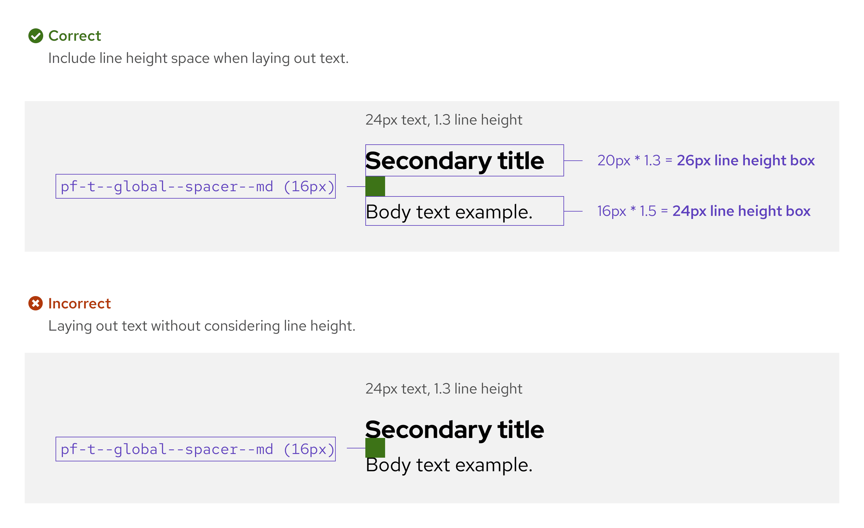
Line height and spacing
The line height of your text impacts how you should use spacers in your design.
Your overall line height can be calculated by multiplying the font's built-in line height by the text size.
For example, if your font has a line height of 1.5 and a size of 16px, the final height of a line of text would be 24px (16px * 1.5 = 24px). In this example, you would consider the final line height of 24px when creating designs.
Line length
Line length measures the number of characters in a single line of text, including spaces. To increase readability and contribute to well-balanced spacing on a screen, use line lengths between 20 and 100 characters.
Lines that are too long can be difficult to follow, while lines that only include a few words per line can use space inefficiently.
