
Usage
There are certain cases where specific buttons must be used within your UI.
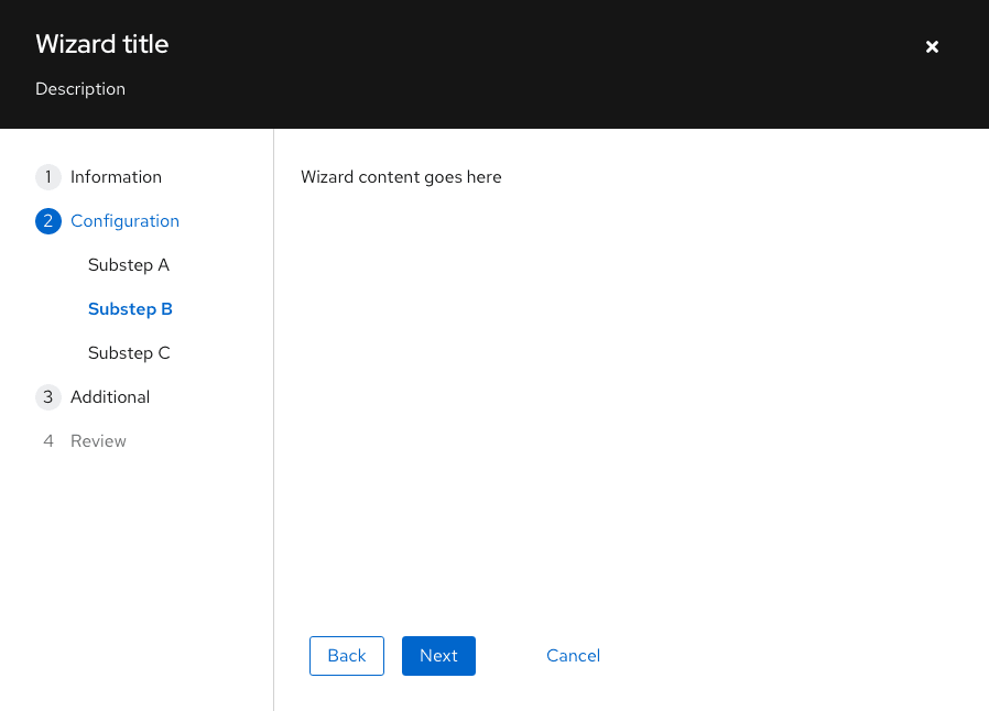
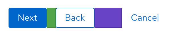
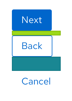
Follow these guidelines for buttons in wizards (shown in the image below):
- The Next button should always be a primary button.
- The Back button should always be a secondary button.
- The Cancel button should always be a link button.
Variations
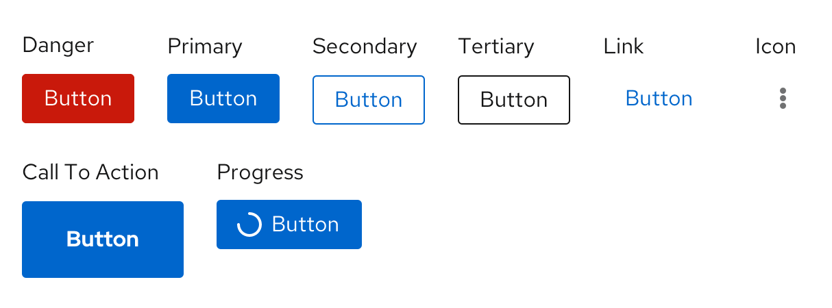
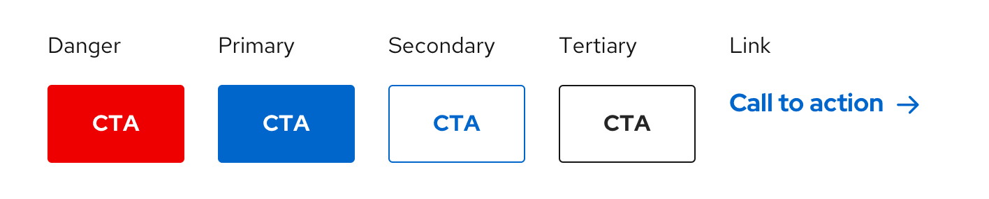
The following button styles, shown in order of visual hierarchy, can be used in your designs according to your needs.
- Danger button
- Primary button
- Secondary button
- Tertiary button
- Link button
- Icon button
- Call To Action button
- Progress button
You don't need to use these buttons in the order that their labels imply. For example, you don't always need to use the secondary button as the second button in your designs. The most important thing is to establish a visual hierarchy between any buttons in your designs. There are, however, some best practices to keep in mind.
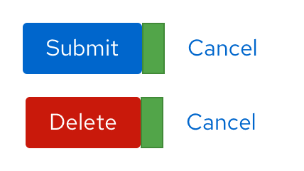
Danger button
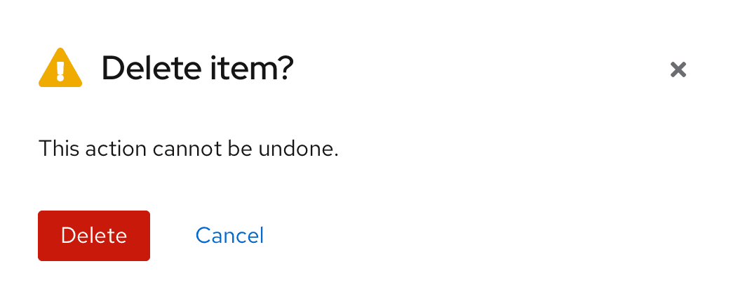
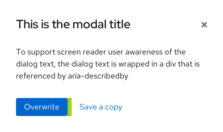
Danger buttons are the most prominent of all the button options. Use danger buttons for actions a user can take that are potentially destructive or difficult/impossible to undo, like deleting or removing user data. These are mostly found in modals to emphasize a destructive action the user is about to take.
Example of a danger button in a modal
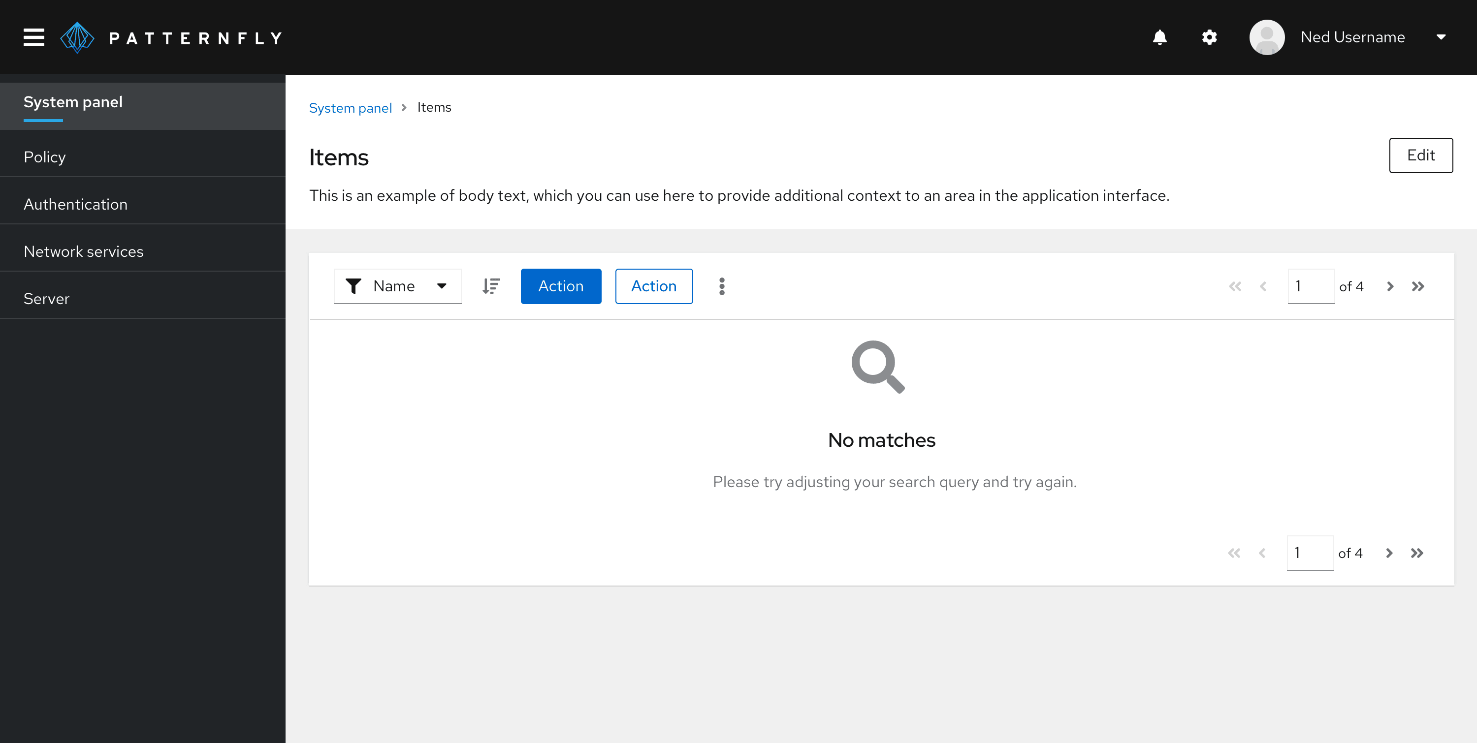
Primary button
A primary button is the most prominent button on a page, used for the most important call to action on a page. Try to limit primary buttons to one per page.
Example of a primary button inside a toolbar

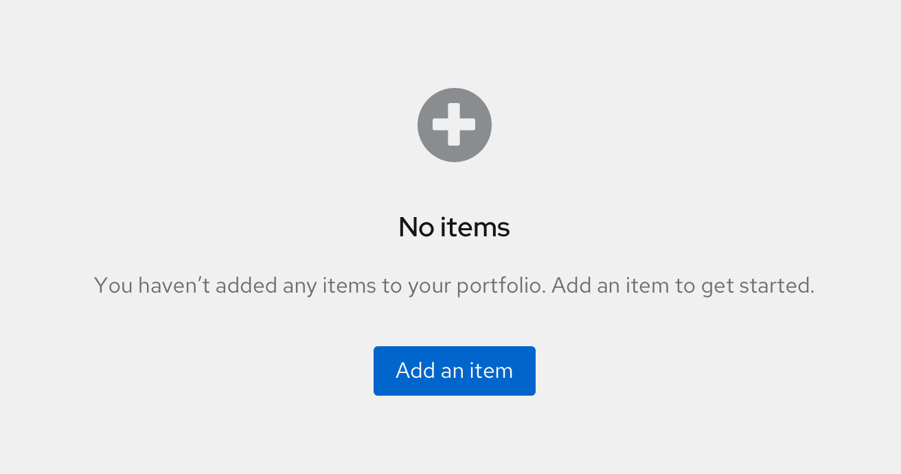
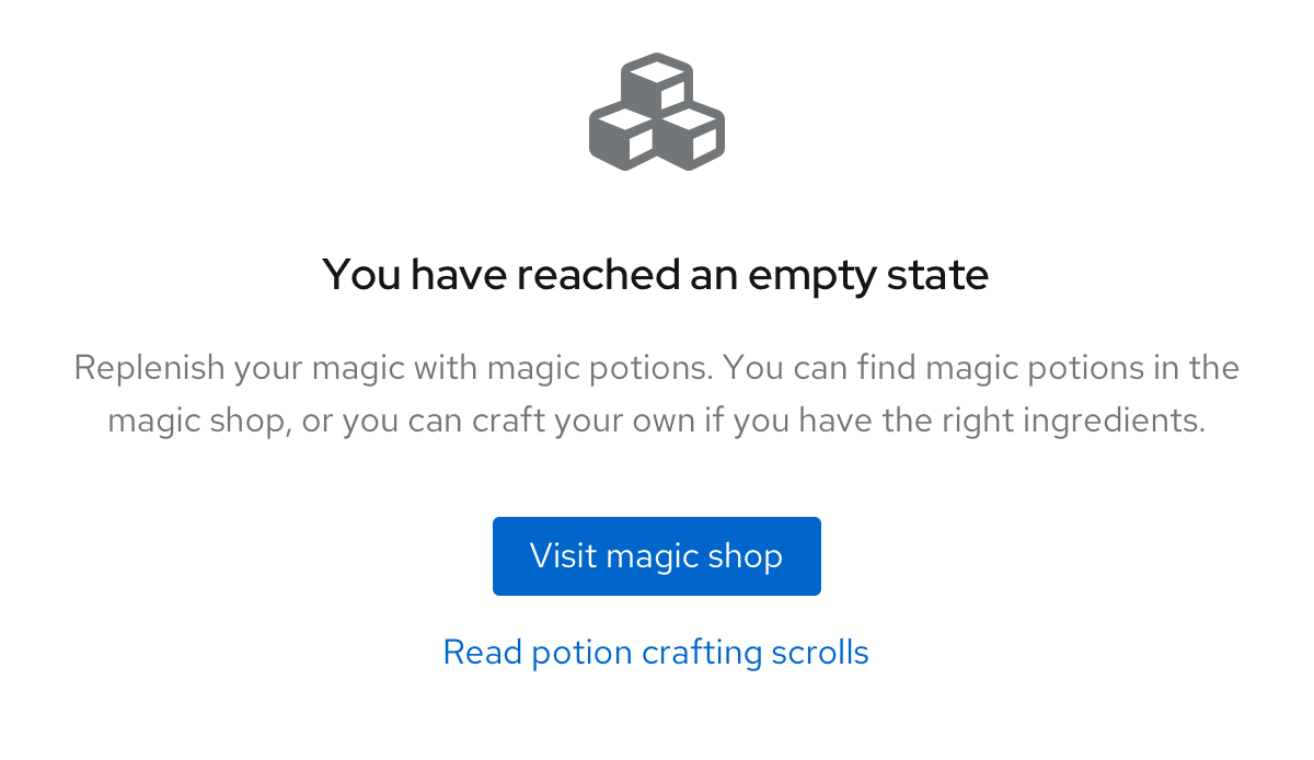
Example of a primary button inside an empty state
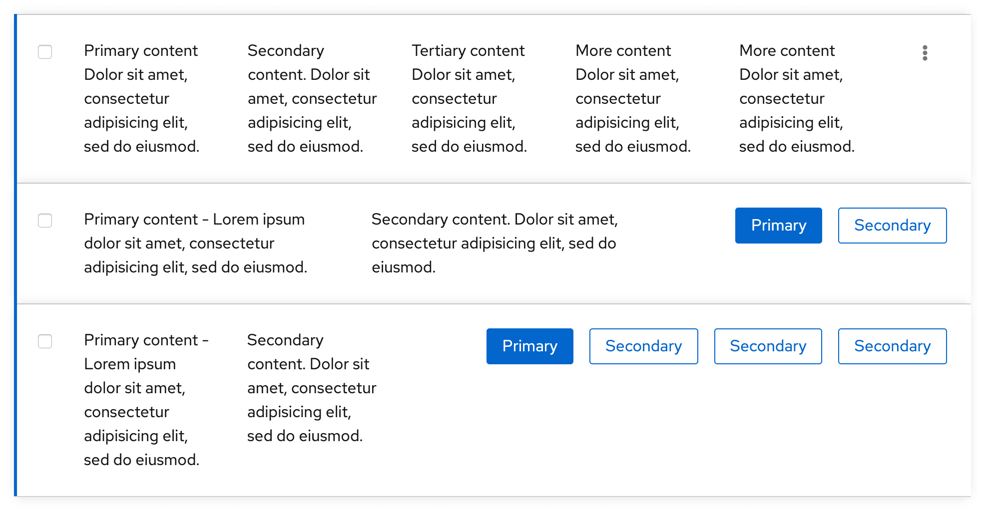
Secondary button
Secondary buttons are buttons with less visual prominence than primary buttons. Use secondary buttons for general actions on a page, that don’t require as much emphasis as primary button actions. For example, you can use secondary buttons where there are multiple actions, like in toolbars or data lists.
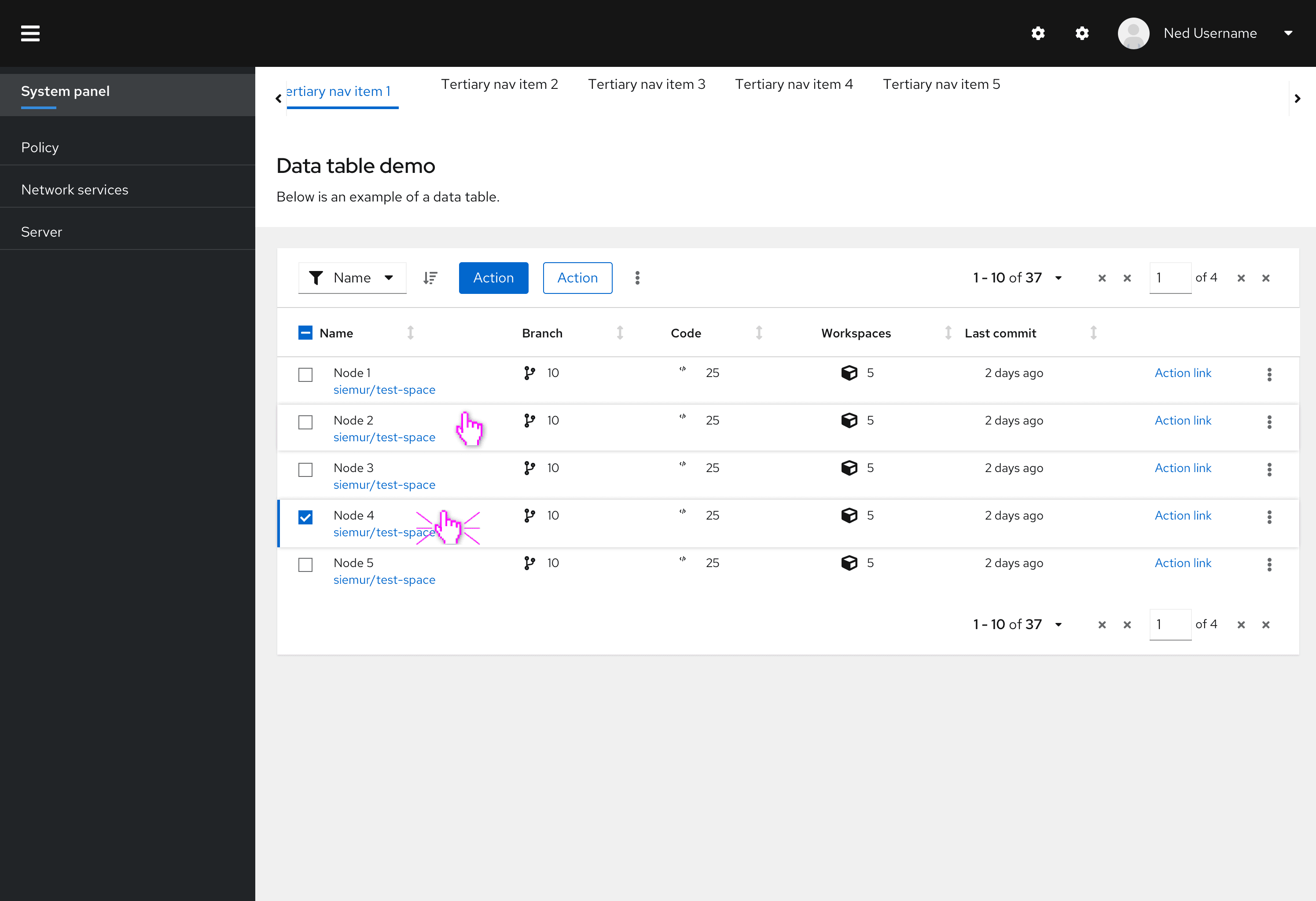
Example of secondary buttons in data lists
Tertiary button
Tertiary buttons are one the least visually prominent buttons and are designed to be less striking than a primary or secondary button, while still retaining a classic button format. Tertiary buttons are flexible and can be used as needed.
In this example, you can see a tertiary button used to show a possible “Edit” action. This button format highlights the action, while making it clear that it is not the main call to action on the page.
Example of tertiary button on a page
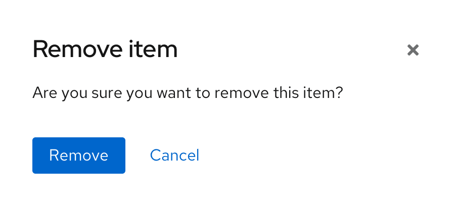
Link button
Links buttons are labeled buttons with no background or border. Link buttons can be used for actions that:
- May not need as much emphasis.
- Navigate users to another page within the same window.
- Navigate users to an external page.
While all link buttons lack borders, they can still vary in appearance. Link buttons that navigate users to another page within the same window should be presented as stand-alone text. Link buttons that navigate users to an external page may include an icon on the left or right of the text to further emphasize the action. For example, you could add an external link icon to show that clicking on it will navigate users externally to another website or application.

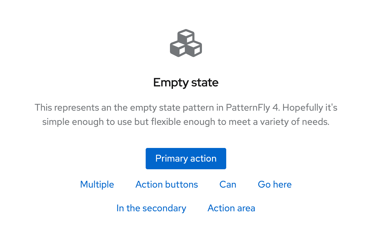
You might use a link button instead of a secondary button format to create greater visual hierarchy between two buttons. Examples include using text buttons as cancel buttons in modals or wizards, as well as for secondary actions in empty states.
Example of a link button in a modal
Example of link buttons in an empty state
When to use
Always use link buttons in the following cases:
For cancel buttons in wizards or modals
For more actions in empty states
For action buttons in tables
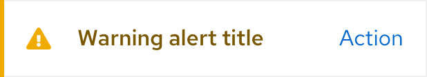
For action buttons in alerts
Icon button
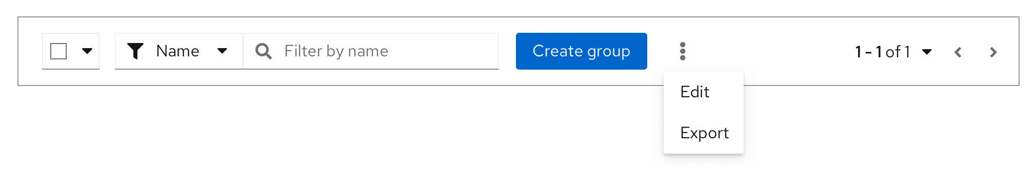
Icon buttons are useful in places where space is limited. For example, if you have too many actions within a menu, you could use a kebab icon to indicate more actions, or an export icon for exporting data. You can also use this button type for actions that are commonly associated with icons, like an exit icon to close a window or a hamburger icon to open a menu.
For example, this toolbar uses a kebab icon as an action button due to limited space.
Call To Action button
Call To Action (CTA) buttons and links are used on websites to direct users to complete an action. For example, a product detail page could include a CTA button labeled 'Try it now,' which would guide users to a purchase page.
Call To Actions have similar variants to regular buttons (although they have a larger padding), and follow the same visual hierarchy. However, CTA buttons are used only to indicate a desired next step, whereas other button types may also be used to link to additional information or actions. Call To Actions should be used sparingly (ideally one per page, or a primary and secondary CTA).
Progress button
A progress button can be used to provide the user with feedback that an action is in progress after the button is clicked. To indicate that an action is taking place, a spinner is inserted in front of the button label.
When to use a progress button
Use a progress button for in-page checks that must be completed before proceeding to the next screen.
When not to use a progress button
Do not use a progress button for operations that will take more than a few seconds, or operations that open to a new page. Instead, use a progress bar.
Example of using a progress button to test a repository before final configuration
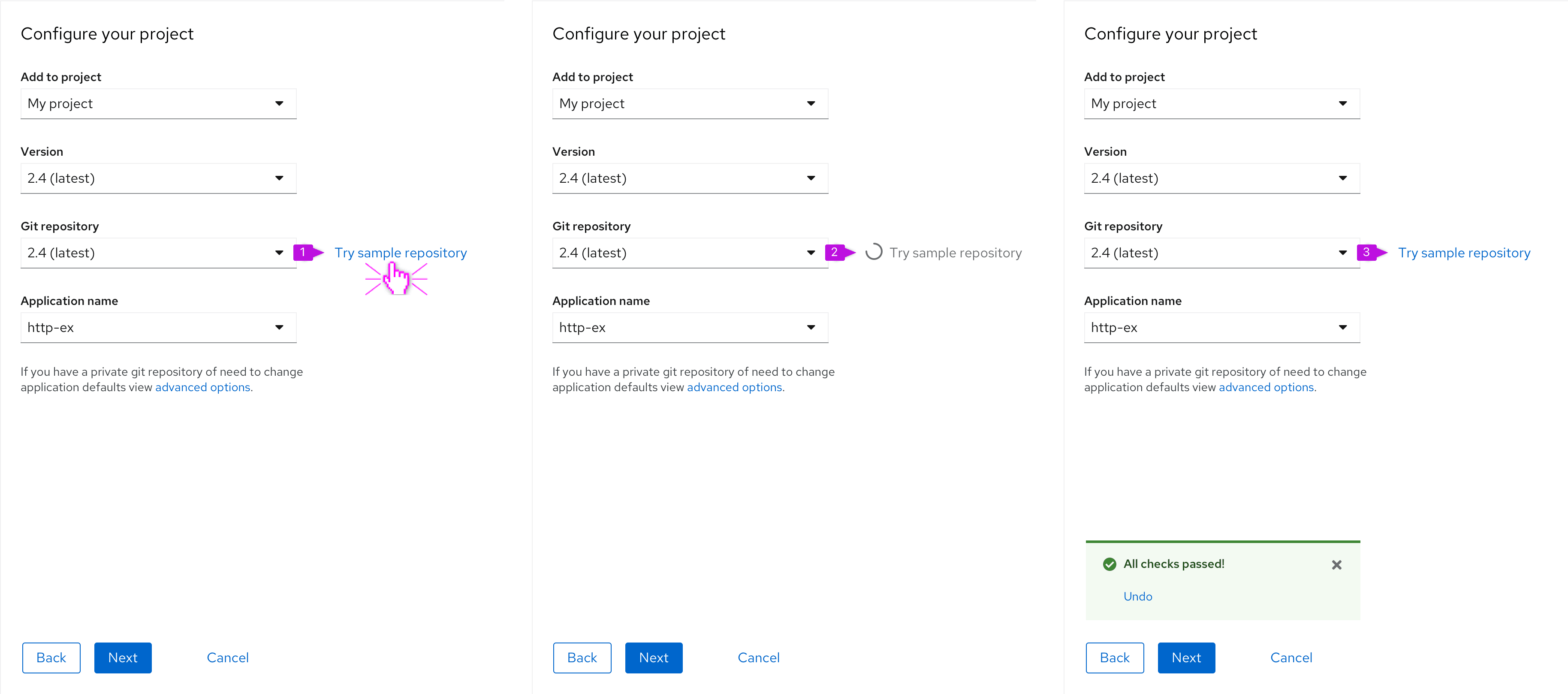
The user clicks “try sample repository".
The spinner will become disabled, indicating to the user that a process is loading and there is no action to take on the button at this time.
When complete, a toast message will appear to indicate the status of the process (successful or unsuccessful), and the progress button will return to it’s initial state.
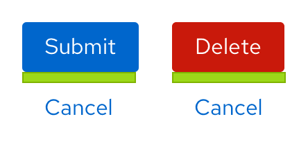
Spacing
Button spacing and action lists
The standard spacing between each button is 16px, even for danger buttons. If buttons are stacked vertically, the spacing between each button should be 8px.
Standard spacing
Stacked spacing
Exceptions
Exceptions to the standard spacing guidelines are as follows:
Wizards
In wizards, the Cancel button is spaced 48px away from the primary and secondary Next and Back buttons, and 24px away if stacked.
Wizard spacing
Wizard stacked spacing
Modals
In modals, the primary button is spaced only 8px away from the secondary button, rather than the standard 16px.
Modal spacing
Toolbars
Button spacing in toolbars depends on the button type. Normal 16px spacing applies between primary and secondary buttons. However, there should only be 8px between icon buttons.
Toolbar spacing
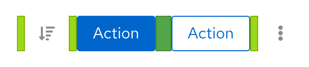
If you have a specific use case where buttons need to be spaced further away from the rest, the button groups action list allows for customization as needed.
Action group spacing

Buttons and overflow menus
There are cases where you will have multiple buttons next to each other, like in a toolbar. When the space shrinks (e.g., switching from desktop to mobile view), you can have the buttons collapse into a kebab overflow menu. Additionally, you can choose to make the primary action persist or have all options collapse into the kebab.
Buttons appear in the toolbar

Buttons placed in overflow menu due to limited space, with primary button persisting
Placement
Buttons in forms, modals, or wizards should always be left aligned in the box. This solves for:
- Modularity and flexibility: A standard alignment creates consistency in how objects appear across all areas of an app.
- Accessibility: The form submit buttons are on the same scan line as the form fields, which benefits users who are sight-limited. Also, users who are blind can more easily navigate left-aligned form submit buttons because the button order is consistent across all contexts.
- Responsiveness: The most important actions (i.e., primary buttons) are encountered first when elements are stacked vertically.
Content considerations
Writing button labels
When writing button labels:
- Be specific and clearly communicate the button's action.
- Make sure that button text is unique and easily understood on its own, so that screen readers may read buttons to users out of context. Refer to PatternFly's accessibility guide for more information.
- Use simple verbs or verb phrases.
- Aim for short labels when possible (1–3 words), to avoid wrapping.
- Avoid using articles (for example, write “Add source” instead of “Add a source”).
- Avoid punctuation on buttons.
- Add an icon to the button to call a user's attention to it or to clarify the button's action.
- Do not create icons on buttons using punctuation (for example, "+"). Instead, refer to PatternFly's icons page for any icons you place on buttons.
Writing link labels
Use specific, action-focused labels that match what the user will see when they arrive at their location. For example, if you are sending a user to a dashboard, your link label might read View dashboard. For a link directing a user to a support forum, the label might read Get help in the support forum. See PatternFly's content guidelines for additional guidance.
Accessibility
For information regarding accessibility, visit the button accessibility page.
View source on GitHub
