
PatternFly colors
This guide outlines the PatternFly color palette, as well as guidance for color use in different scenarios. Note that the color swatches and palettes automatically change to accommodate light or dark themes. To learn more about PatternFly’s dark theme, refer to our dark theme handbook.
In this guide, you can select each color swatch to learn more details, such as hex values and usage guidance.
Refer to our developer resources to see a list of all global CSS color variables.
Primary colors
Primary colors are those displayed most frequently across your application screens and components. Our primary color is called "PatternFly blue", which is used across PatternFly's components. PatternFly blue should change upon hover.
--pf-v5-global--primary-color--100--pf-v5-global--primary-color--200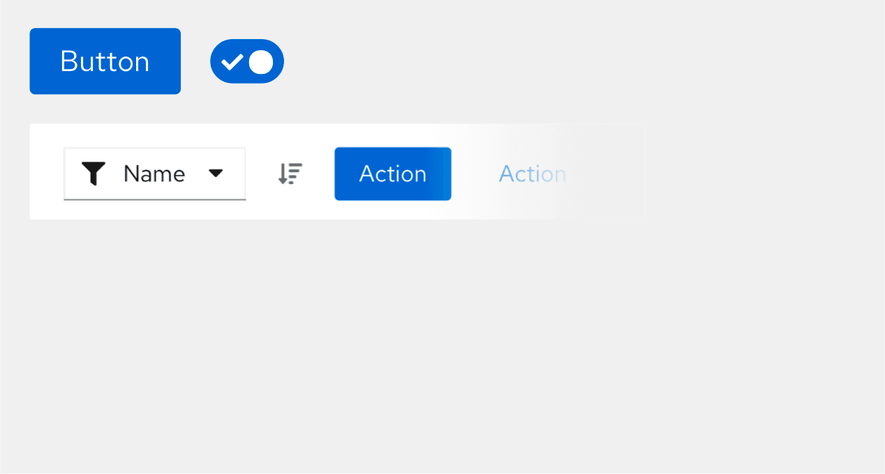
Typography and iconography colors
Text and icon colors are extremely similar because they can often be used in the same context, such as for a link button. We support multiple shades of text colors so that you can emphasize hierarchy on both light and dark backgrounds.
--pf-v5-global--Color--100--pf-v5-global--Color--200--pf-v5-global--link--Color
Background colors
Background colors are used throughout components and, occasionally, for certain screens. Light colors can be used interchangeably with full-screen backgrounds, while dark colors are strictly used as backgrounds within components.
Light backgrounds
--pf-v5-global--BackgroundColor--200--pf-v5-global--BackgroundColor--100Dark backgrounds
--pf-v5-global--BackgroundColor--dark-100--pf-v5-global--BackgroundColor--dark-200--pf-v5-global--BackgroundColor--dark-300--pf-v5-global--BackgroundColor--dark-400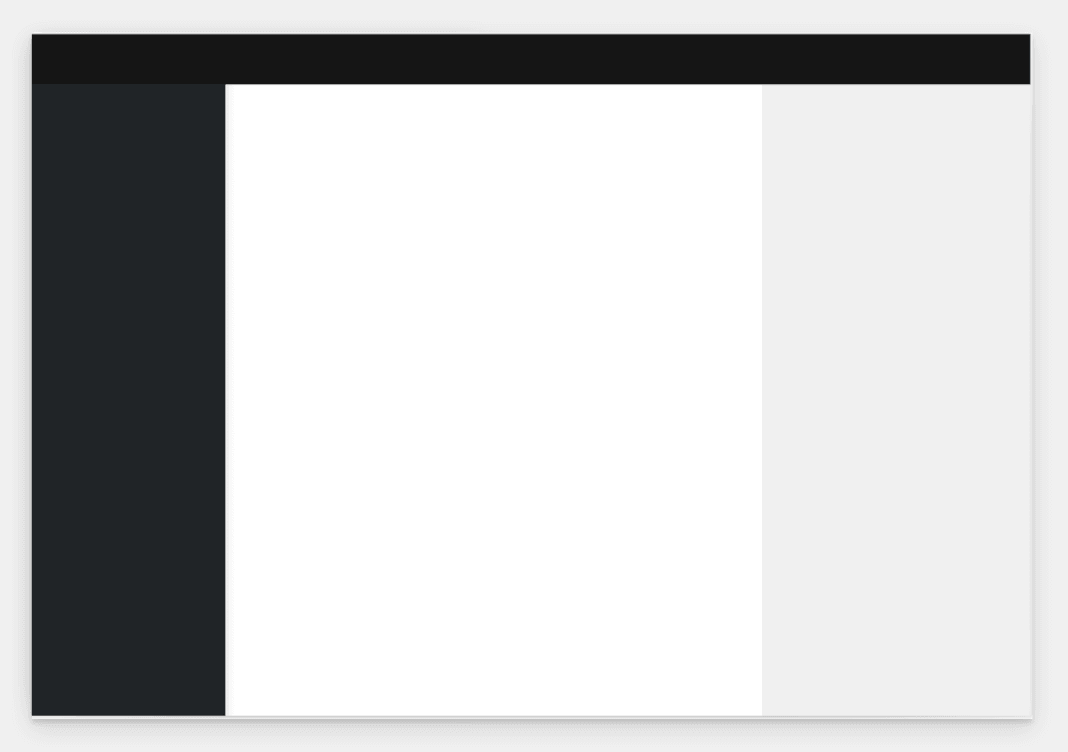
Status and state colors
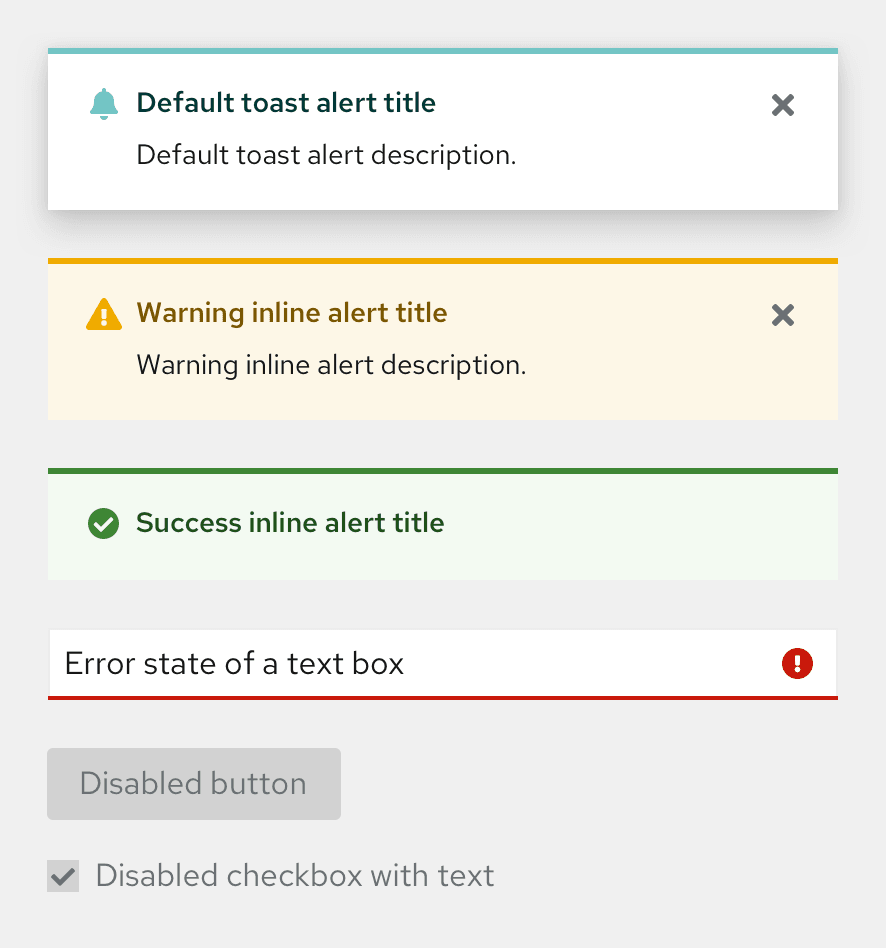
Default
--pf-v5-global--default-color--300--pf-v5-global--default-color--200--pf-v5-global--palette--cyan-50Danger
--pf-v5-global--danger-color--200--pf-v5-global--danger-color--100--pf-v5-global--palette--red-50Success
--pf-v5-global--success-color--200--pf-v5-global--success-color--100--pf-v5-global--palette--green-50Info
--pf-v5-global--info-color--200--pf-v5-global--info-color--100--pf-v5-global--palette--blue-50Warning
--pf-v5-global--warning-color--200--pf-v5-global--warning-color--100--pf-v5-global--palette--gold-50Disabled
--pf-v5-global--disabled-color--100--pf-v5-global--disabled-color--200--pf-v5-global--disabled-color--300Shadows
Shadows can be used to create contrast between UI elements. PatternFly supports different shadow sizes, which enable you to increase the visual depth of a UI element and distinguish it from other elements on the screen.
--pf-v5-global--BoxShadow--lg--pf-v5-global--BoxShadow--md--pf-v5-global--BoxShadow--sm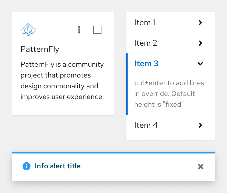
Contrast ratios
PatternFly's goal is to meet level AA in the Web Content Accessibility Guidelines 2.1. To meet level AA requirements, your UI contrast ratios must be at or above 4.5:1 for normal text, 3:1 for large text, and 3:1 for graphics and other UI components. Additionally, on hover, link text color should have ample contrast from both the background color and the default state link color.
To check the contrast between background and text colors, use a WCAG AA-compliance tool.
PatternFly palettes
Our color palettes are created as a system, designed to reinforce content and workflows. Our palettes are carefully chosen to support effective communication and adapt to the needs of your UI.
Note that bright colors are used sparingly and are reserved for specific interactions, such as communicating status.
Our color palettes are organized into "families" that contain different shades of the same hue. In the following palettes, you can expand each value color or shadow in a family to see more details.
Gray family
- white#FFFFFF
- black-100#FAFAFA
- black-150#F5F5F5
- black-200#F0F0F0
- black-300#D2D2D2
- black-400#B8BBBE
- black-500#8A8D90
- black-600#6A6E73
- black-700#4F5255
- black-800#3C3F42
- black-850#212427
- black-900#151515
- black-1000#030303
Blue family
- blue-50#E7F1FA
- blue-100#BEE1F4
- blue-200#73BCF7
- blue-300#2B9AF3
- blue-400#0066CC
- blue-500#004080
- blue-600#002952
- blue-700#001223
Shadows
- box shadow sm
- box shadow md
- box shadow lg
Green family
- green-50#F3FAF2
- green-100#BDE5B8
- green-200#95D58E
- green-300#6EC664
- green-400#5BA352
- green-500#3E8635
- green-600#1E4F18
- green-700#0F280D
Cyan family
- cyan-50#F2F9F9
- cyan-100#A2D9D9
- cyan-200#73C5C5
- cyan-300#009596
- cyan-400#005F60
- cyan-500#003737
- cyan-600#002323
- cyan-700#000F0F
Purple family
- purple-50#F2F0FC
- purple-100#CBC1FF
- purple-200#B2A3FF
- purple-300#A18FFF
- purple-400#8476D1
- purple-500#6753AC
- purple-600#40199A
- purple-700#1F0066
Light blue family
- light-blue-100#BEEDF9
- light-blue-200#7CDBF3
- light-blue-300#35CAED
- light-blue-400#00B9E4
- light-blue-500#008BAD
- light-blue-600#005C73
- light-blue-700#002D39
Gold family
- gold-50#FDF7E7
- gold-100#F9E0A2
- gold-200#F6D173
- gold-300#F4C145
- gold-400#F0AB00
- gold-500#C58C00
- gold-600#795600
- gold-700#3D2C00
Light green family
- light-green-100#E4F5BC
- light-green-200#C8EB79
- light-green-300#ACE12E
- light-green-400#92D400
- light-green-500#6CA100
- light-green-600#486B00
- light-green-700#253600
Orange family
- orange-50#FFF6EC
- orange-100#F4B678
- orange-200#EF9234
- orange-300#EC7A08
- orange-400#C46100
- orange-500#8F4700
- orange-600#773D00
- orange-700#3B1F00
Red family
- red-50#FAEAE8
- red-100#C9190B
- red-200#A30000
- red-300#7D1007
- red-400#470000
- red-500#2C0000
View source on GitHub
