
PatternFly provides accessible components, but we can't guarantee that your products will be accessible. In order to ensure that your product is accessible, you will need to take additional steps during development, as described in the following guidelines and techniques.
Prioritizing accessibility during development
As you develop your product, you should keep accessibility top of mind, by asking yourself a few questions:
Can all users discover and perceive elements?: If you can see or click on an element, then all users should be able to locate and navigate to it. This should include those that use a keyboard or other assistive technology, such as a screen reader.
Can all users interact with elements?: It should be easy for users to use an element once it's in focus. They should be able to interact with elements and initiate actions via keyboard (like pressing Enter to initiate a button action) and screen readers.
Can all users understand elements?: It should be clear what actions elements can perform. For example, buttons should have visible text that would be clear out of context of the page. If not, it should have an
aria-labelor accessible name.
Development techniques
These are some of the items outside the scope of PatternFly that you should prioritize to ensure accessibility:
- GuidelineLinkCategory
- Contentsdesign
UI element accessibility techniques
The WCAG 2.0 techniques provide examples on how to meet accessibility guidelines. The following techniques are standard across PatternFly for specific patterns.
Labeling with ARIA
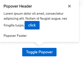
For sighted users, the context and visual appearance of an element can help users understand its purpose. But this isn’t always the case. For example, the X, often used in the top-right corner of pop-ups to indicate the control for closing, might not be clear to those using assistive technology:
ARIA supplements HTML so that common application interactions and features can be passed to assistive technologies when there is not a native mechanism. This is typically done by including an aria-label that provides descriptive context to assistive technologies. Only use labels when they are necessary to make an element accessible. ARIA is meant to add context when there isn’t visible text, not to override or reiterate what’s already there. Make sure that your labels are useful and not redundant.
Note that ARIA can only affect the semantics of an element; it has no effect on its behavior. For example, while you can make an element hidden to screen readers with aria-hidden=”true”, that does not hide the element from focus.
Form fields
Use explicit linking between label and form input elements (such as input, textarea, or select) when both are present. This "H44" guidelines provides an accessible name to screen readers and makes the label clickable to increase the overall clickable area of the form element.
When a label element cannot accompany a form input element, provide one using using aria-label or aria-labelledby, as outline by the "ARIA14" guidelines.
In a single-field form, the submit button label can serve as the field label for sighted users, following the "G167" guidelines. For assistive devices, use aria-labelledby.
Icons
To render icons as something that assistive devices can ignore, pass aria-hidden='true' to all icons, either to the icon element or a parent element of the icon.
Decorative and semantic icons
There are 2 main categories of accessible icons:
Decorative icons, which can be removed without affecting the page's information.
Semantic icons, which provide information that isn't present on the page. For example, these can represent status, indicate an alert message type, or replace text as button labels. The meaning of a semantic icon must be provided in alternative ways to the user. Additionally, you should follow these guidelines:
Add a label for the icon in tooltip text that displays on hover and focus.
For interactive elements (like
<a>and<button>), where an icon is used as the label instead of text, set a label as anaria-label.Example:
<button class="..." aria-label="Close Dialog">
  <i class="..." aria-hidden="true"></i>
</button>
Non-interactive icons
For non-interactive icons, include .pf-v5-screen-reader text near the icon. Depending on the component, this text might not be a direct sibling to the icon element.
For example, in the alert component, the icon label text is adjacent to the message:
{
  <div class="pf-v5-c-alert pf-m-success" aria-label="Success Alert">
  <div aria-hidden="true" class="pf-v5-c-alert__icon">
    <i class="fas fa-check-circle"></i>
  </div>
  <div class="pf-v5-c-alert__body">
    <h4 class="pf-v5-c-alert__title">
      {{#> screen-reader}}Success:{{/screen-reader}} Success alert title
    </h4>
  </div>
</div>
}
Images
All images should have alt text so that assistive technology can provide an image description. When an image contains words that are important to understanding the content, the alt text should include those words. This allows the alt text to communicate the same message as the image itself.
Note: Alt text does not necessarily describe the visual characteristics of the image itself. It just needs to convey the same meaning as the image.
The exception to this practice is when images are primarily for presentation purposes and are not essential pieces of content. To signify that an image should be skipped by a screen reader, set the value of the alt attribute to an empty string: alt=””.
Trapping focus
The recommended interaction pattern for components like the modal or popover is to trap focus within the component's modal element when it becomes visible.
For keyboard-only users who use the tab key to navigate the interface, trapped focus means that focus cannot be shifted outside of the modal when using the tab key. Instead, when focus leaves the last focusable item, it should move to the first focusable item of the modal.
For screen reader users, the other contents on the page should be hidden from the screen reader.
Based on the screen reader / browser combinations we use for testing, we recommend applying aria-hidden="true" to the parent wrapping element of the page contents. The modal element of the component must not be a descendent of this element, and should be included as a sibling to this element.
Scrollable elements
Any elements with horizontal or vertical scroll need to be accessible via keyboard.
Parent elements should be able to capture browser focus and be scrolled using the arrow keys. Some browsers will automatically make scrollable elements focusable to ensure keyboard accessibility, as long as they have a non-negative tabindex. It may be necessary to ensure that every container with overflow content which can grow larger than its parent's height to have tabindex=0.
When tabIndex is added, you should either add role='region' and an aria-label that describes the scrollable element, or an aria-labelledby to a descriptive and accessibly named heading.
Some screen reader users navigate page elements via an element list or rotor menu, and the default label for these scrollable elements will be driven by whatever text content exists inside the container. This generated label may not be suitable to describe the region's purpose, and would likely be better described with a simple aria-label.
For example:
<div role="region" style="height: 200px; overflow-y: auto" tabindex="0" aria-label="Scrollable content">
    <div style="height: 2000px">
        <p>Content</p>
    </div>
</div>
Screen reader considerations
Just as front-end developers use their browser to see how their changes look, you should use a screen reader to see how your accessibility looks. You can use a screen reader that is available in your operating system, like VoiceOver for Mac, or you could download an open-source screen reader like NVDA if you have a PC.
To test PatternFly, we target the following screen readers:
- JAWS with Chrome, Windows (JAWS keyboard shortcuts)
- Voiceover with Safari, Mac (Voiceover keyboard shortcuts)
- NVDA with Firefox, Windows (NVDA keyboard shortcuts)
Generally, screen readers access the Document Object Model (DOM) and use browser Application Programming Interfaces (APIs) to get the information they need. In this way, a screen reader knows what to say when a set of list items begins and ends, and can typically announce how many items are in the list in advance. A screen reader can also traverse a page using heading navigation to speak the heading level.
There are a few aspects that can affect how screen readers communicate information, which you should consider when building and testing your product:
Semantic HTML: Semantics refers to the meaning of a piece of code. A semantic element clearly describes its meaning to both the browser and the developer. For example,
<div>and<span>are non-semantic elements because they don't describe their contents. On the other hand,<form>and<table>are semantic elements, because they clearly define their contents. Screen readers expect semantic HTML when traversing the DOM, so non-semantic elements (that aren't customized to be made accessible) are highly likely to be inaccessible. ARIA and other accessible attributes are meant to extend the functionality and meaning of native semantics, but at the core, your HTML should be semantic.Headings: A user with vision can scan a page to quickly understand its information architecture. Visually impaired users have other methods of achieving this, such as using heading levels to determine the flow of information. Headings that vary in size for design purposes, rather than functionality, will likely confuse these users. A clear flow of sequential heading sizes based on headings and subheadings is significantly clearer to all users.
Accessible names for all elements: When an element doesn't have visual text, or when further explanation is necessary, a screen reader will not know what an item is or does. For example, if you have an icon
<button>without a label, the screen reader can only tell that it’s a button—it can't determine what the button does.Links: Similar to buttons, links should always have a label for clarity (for example, don’t just say “click here”). Without the label, users have no idea where the links point to. If you have the same label for multiple links, each link must point to the same URL. Links, buttons, and form controls should make sense out of context. If a user wants to look at all of the links available, they should be able to differentiate the available links.
Landmarks: Landmarks (such as banners, navigation, main, and form) help communicate the structure of a page by identifying regions. When there are multiple landmarks of the same role (such as 2 navigation regions on the same page), these regions should be differentiated by an
aria-label.Dynamic content: One of the biggest accessibility concerns with dynamic content is the need to notify users that the content has changed. Sighted users benefit from highlighting or drawing visual attention to the changes. Non-sighted users need to be notified in another way, such as loading a new page, sending the focus to the new content, or using ARIA live announcements.
Unrelated notifications: Notifications from the operating system outside of the web app can interrupt a user while interacting with a page (for example, "You received a new chat message."). Consider this possibility when designing and developing for screen readers, and keep any notification messaging concise to limit the interruption.
View source on GitHub
