
The gallery layout is used to arrange content in a responsive grid. Content will wrap responsively to create uniform rows and columns.
Elements
The gallery layout is designed so that all of its elements wrap responsively, are of uniform size, and are displayed horizontally.
- Gallery: The gallery container, which contains all gallery items.
- Gallery item: An individual item to be placed in the gallery.
Usage
While a gallery layout resembles a grid, it is not the same as the grid layout, which is structured more rigidly.
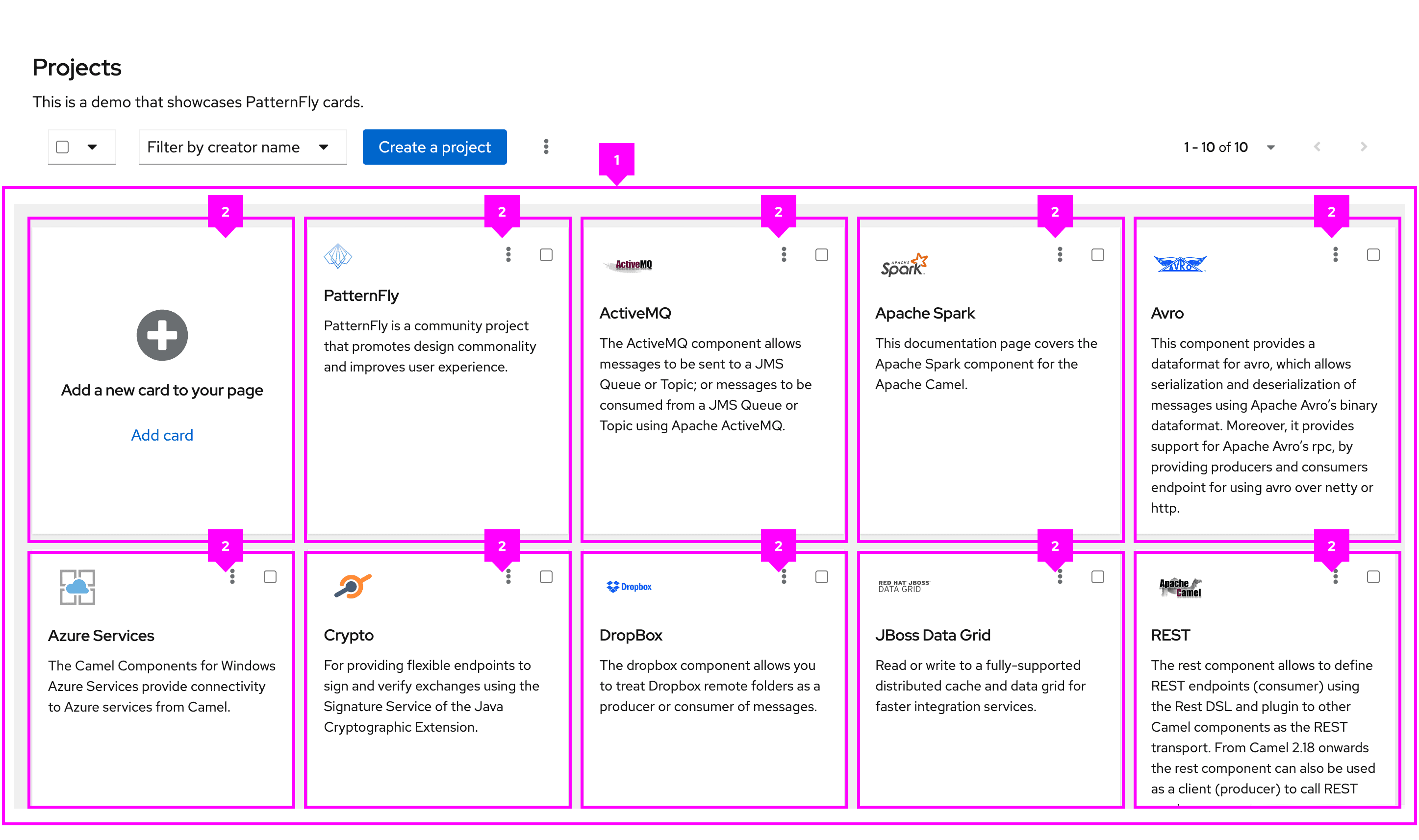
The gallery layout is commonly used for UIs that contain multiple card components.
Variations
Gutters around items
If you want to add spacing between items (a common practice for card views), you can apply gutters.
Items with customized wrapping
Both a minimum and maximum width can be defined for gallery items. These values determine the width that a gallery item is allowed to be before wrapping.
View source on GitHub
