
Usage
Popovers are commonly used on form field labels, page titles or headings, or table column headings. Use popovers to:
- Anticipate and answer questions for the user.
- Help explain unfamiliar terms.
- Provide context around a task.
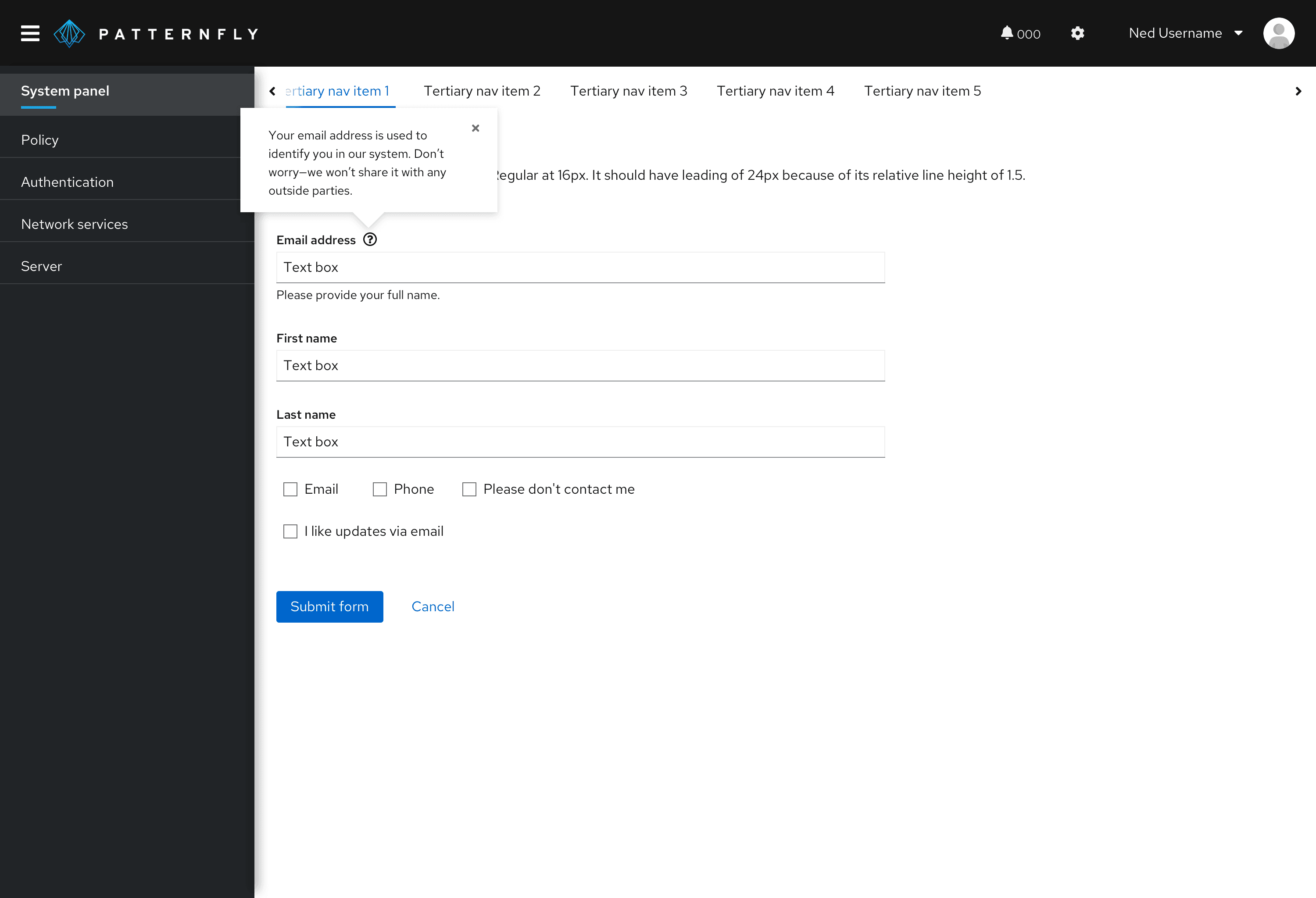
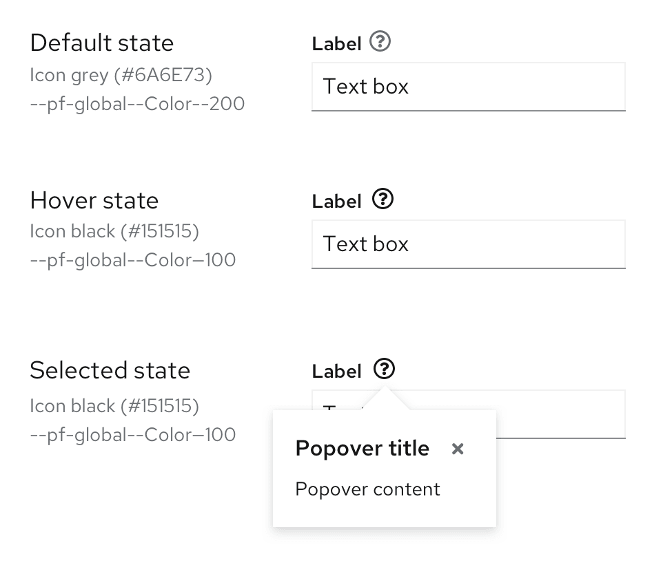
When using a default popover to define a term or explain a concept, use a gray question-circle icon. Upon hover or click, the icon turns black.
To provide more information to a user without an accompanying UI element, you can add a popover to a linked question.
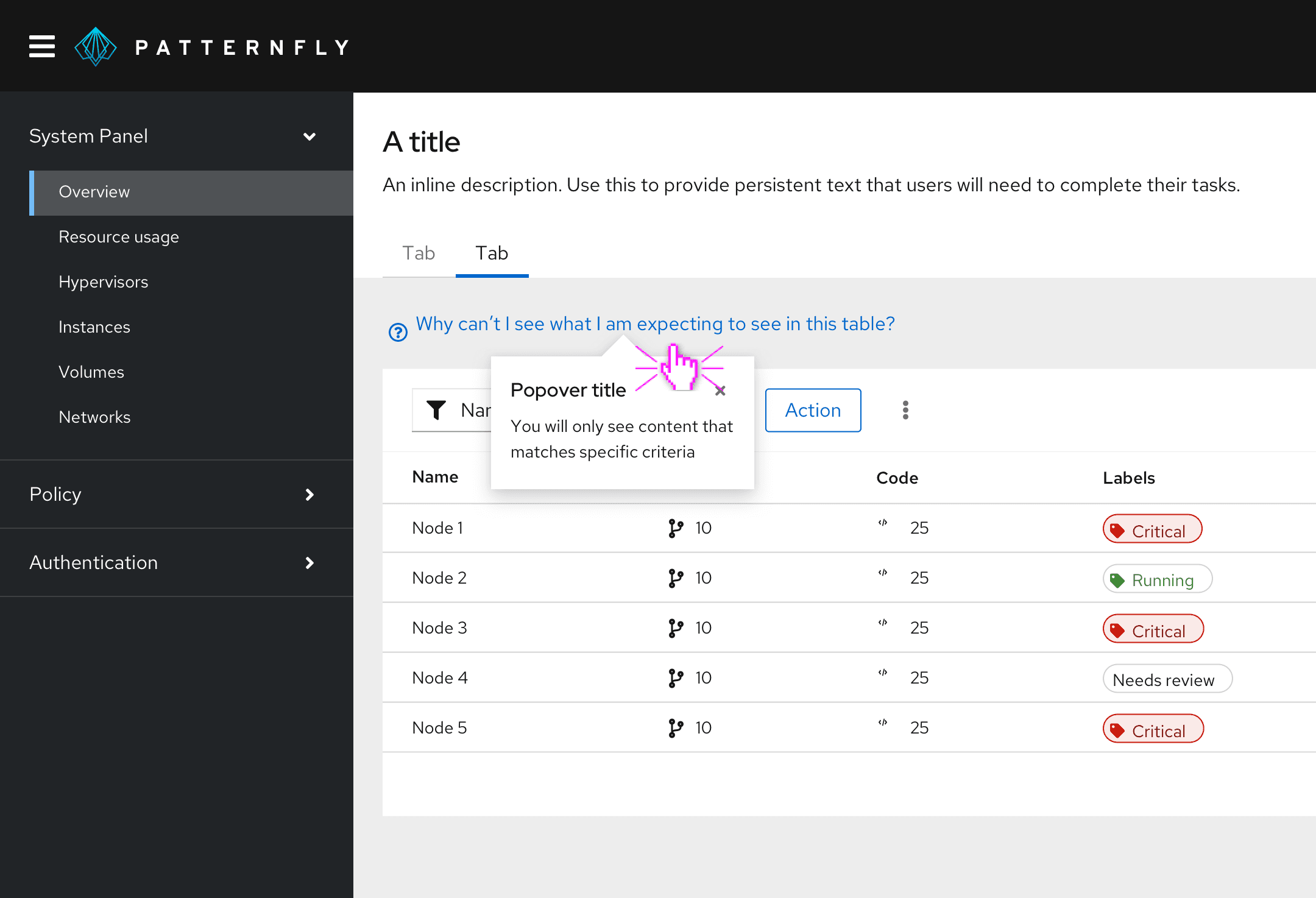
Use link button styling for the linked question, and add a blue question-circle icon before it. Clicking the link text triggers a popover, which answers the linked question.
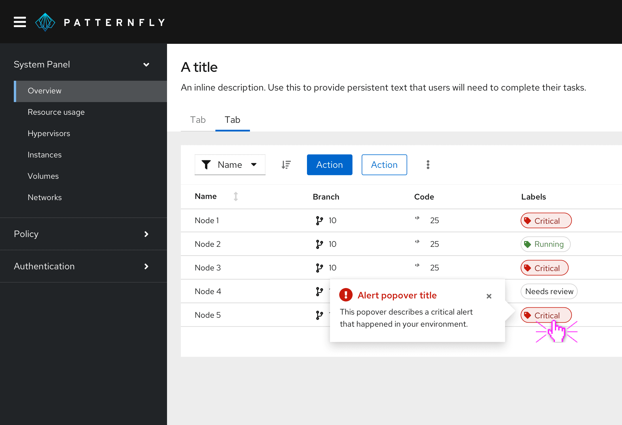
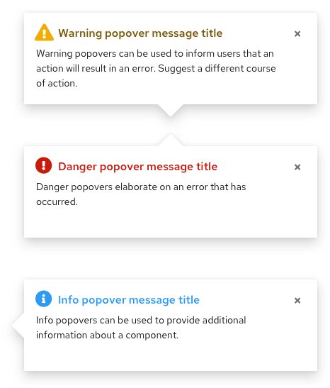
To provide additional information about an alert, use an alert popover. The alert popover will open upon hover or click.
When to use tooltips vs. popovers
Both tooltips and popovers provide more information in context for users. However, they’re different in a few ways:
- Tooltips are used for identification purposes, while popovers are used for added description or information in context.
- Tooltips contain short descriptions or labels, while popovers contain longer descriptions, formatted text, and optional images or links.
- Tooltips appear on hover, while popovers appear on click.
For information on other forms of on-screen help, see Tooltip and Hint.
Behavior
Popovers are triggered when a user clicks on the popover icon and are dismissed in one of the following ways:
- The user clicks the exit icon.
- The user clicks anywhere on the screen outside the popover.
- The user clicks an action button inside the popover. (Note: This won't always close the popover; it depends on the action button.)
Variations
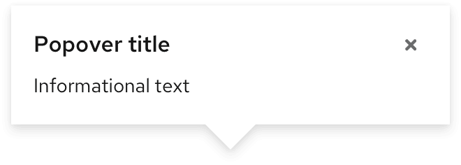
Default popovers
These popovers are plain-text and do not include icons. They are used to convey additional, non-imperative information to the user.
Alert popovers
These popover are similar to default popovers, the key difference being the inclusion of status-like headers for the following alert types: default, info, success, warning, and danger.
Content considerations
- Popover copy is longer than tooltip copy, but it should still be concise. Aim for 1–3 sentences.
- Write in full sentences with punctuation.
- Include relevant links to documentation when necessary.
- Use popovers for additional information. Don’t use popovers for information critical to a user completing a task, such as password character requirements.
View source on GitHub
