
Elements
A basic dropdown consists of a toggle control to open and close a menu of actions or links.
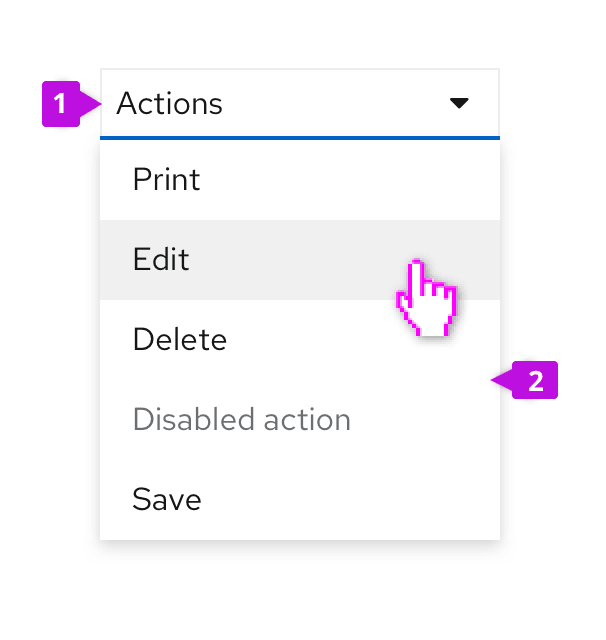
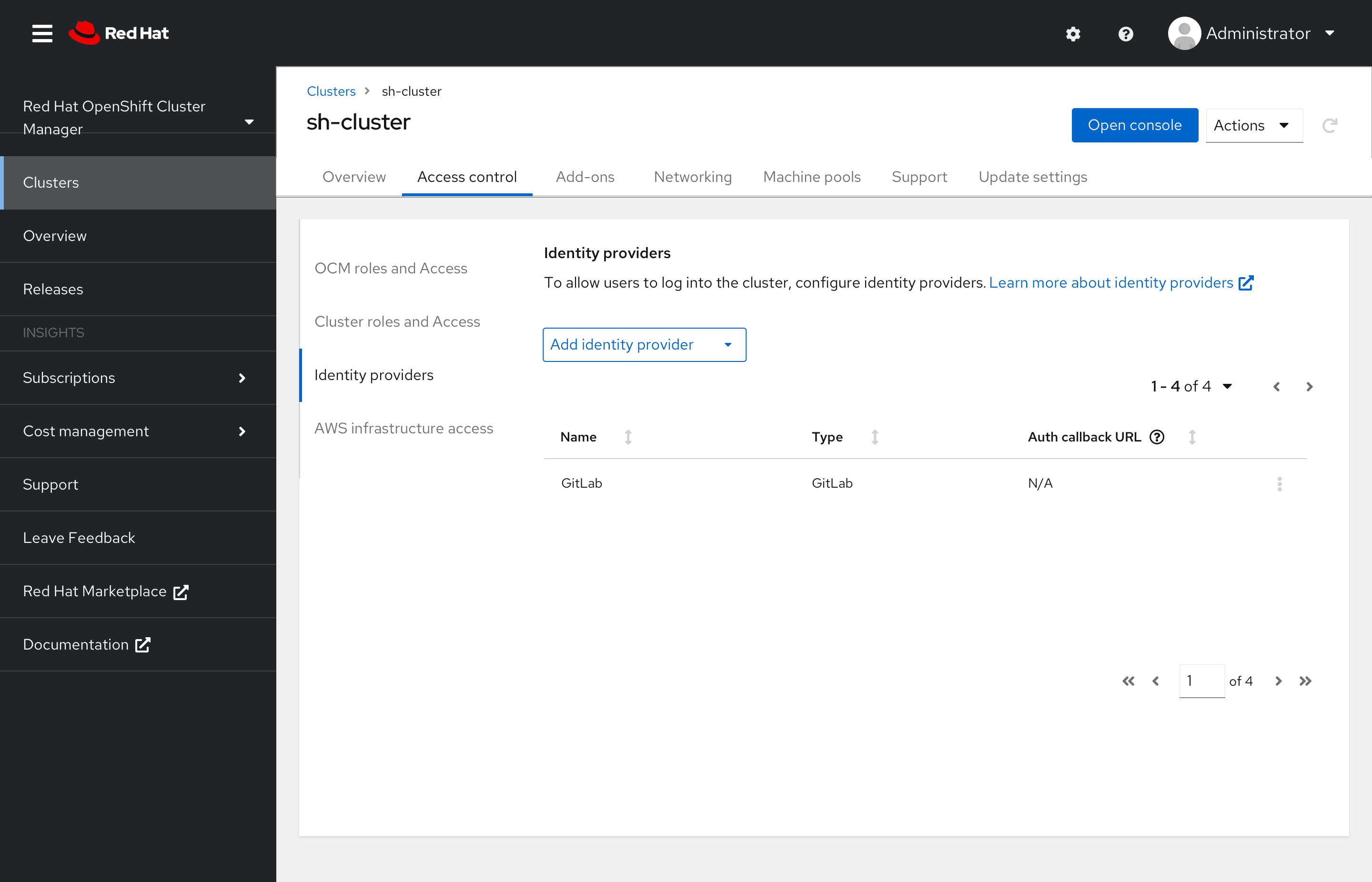
Toggle: The toggle is used to open and close the menu. It takes on all of the behaviors of a button. The toggle label is used to name the menu and should be descriptive of the actions that it contains. If no more descriptive name makes sense, use “Actions” as a default name.
Menu: The menu contains a list of actions or links. Menus should optimally contain seven (7) or less items for easy scanning by the user. For longer menus, items may be grouped. See the menu component guidelines for more information about supported options, including use of icons, grouping, and descriptions. The Dropdown component includes many common built-in menu variants. It’s also possible to attach a custom menu by using the basic panel variant.
Variations
In addition to the basic dropdown shown above, you may apply the following variants to the dropdown toggle element.
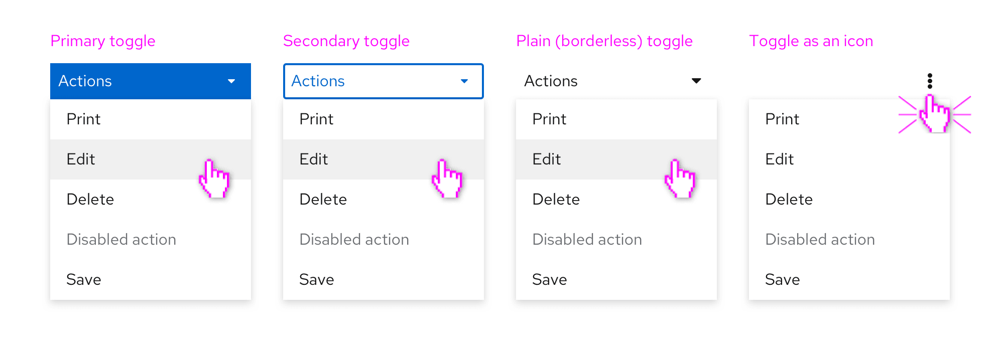
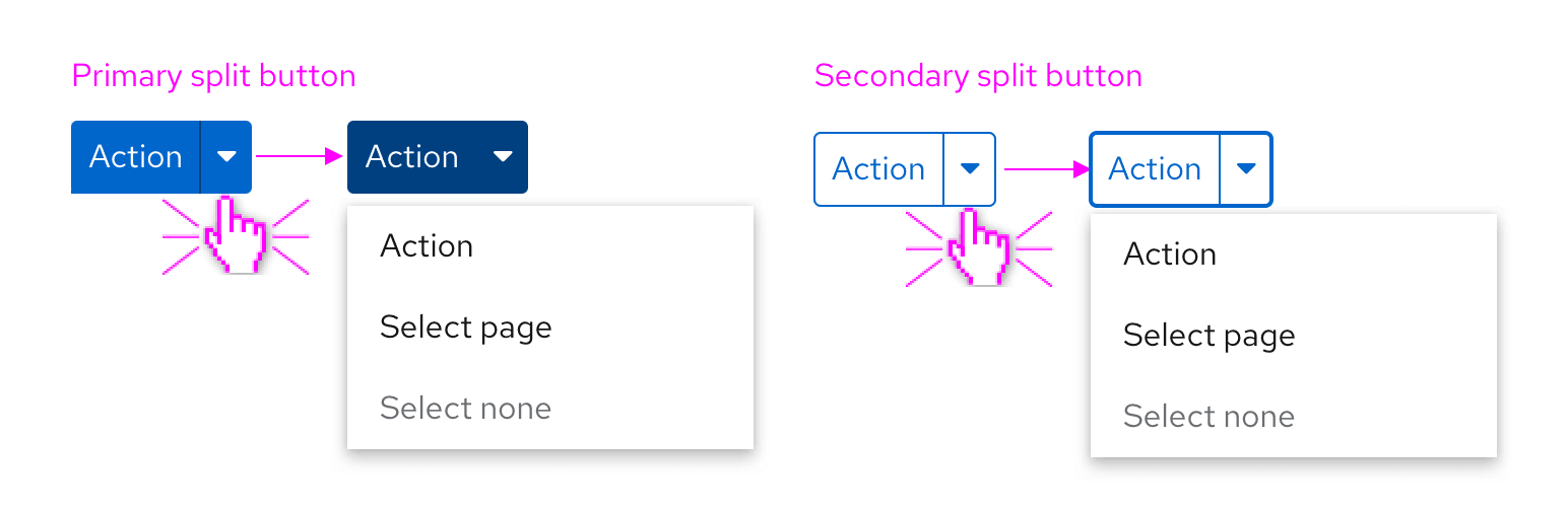
Primary toggle
The primary toggle should be used in the same way as you would use a primary button. If you want to draw the user’s attention to a dropdown menu as the primary place to take action on a page, consider using a dropdown with primary styling.
Secondary toggle
The secondary toggle is a variation of the primary toggle. It has less visual prominence than the primary toggle, but more visual prominence than the basic toggle and other toggle variations. Use a secondary toggle when the actions in the dropdown are the secondary actions you’d want a user to take.
Use a secondary toggle when other toggle variations would appear visually inconsistent, or lack the sufficient prominence needed to create a visual hierarchy.
Plain toggle
Plain styling removes the border treatment from a dropdown toggle. This is useful in places where the default border treatment might make your layout feel visually cluttered or crowded. Use a plain toggle when further action hierarchy needs to be established and you already have primary or secondary action toggle on the page.
Icon toggle
When there is not enough space for a labeled button, an icon can be used instead. Icon toggles are best used when you can use a common icon that has a well understood meaning or when you are working with limited space. A common default is to use the vertical ellipses (kebab) icon to generally indicate that it is connected with a menu as shown above.
Split button
A split button can be used when you want to combine an action button or other control with a dropdown menu. Use a split button action dropdown when you have multiple actions to show that are related to each other, but one action is more likely or important than the rest.
There are two types of split buttons: split buttons with checkboxes and split buttons with actions.
Split button with checkbox
A split button with a checkbox can be used in bulk selection use cases for a list, table, or card grid. Here, the checkbox provides immediate access to bulk selection, and the user can also open the dropdown menu to expose other actions. Text can also be added within the toggle to reflect current state.
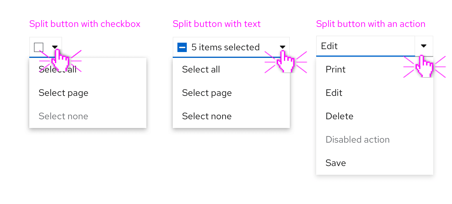
Split button with actions
A split button with actions is useful when you want to expose a default action with a single click, but also allow access to other actions via the dropdown menu. This can be thought of as providing a shortcut to the most recent or frequently used item in the menu. A split button with actions can contain a labeled action or an icon in place of the label for use when there is limited space.
Behavior
In this case, the user can either click on the primary button, or on the caret to open/view the rest of the related options. When a user clicks on an action whether the surfaced one, or one from inside the menu, the action will be selected and applied immediately.
Example
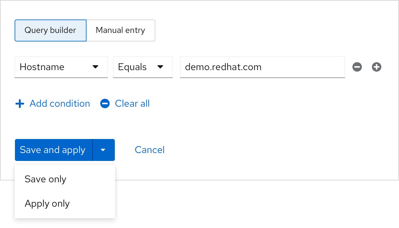
A split action button is used in a modal where there are different possible submit variations. Here, all the buttons are related in that they are different ways to submit the modal, but the surfaced option is the most likely to be used, while the ones housed in the toggle are other less likely options.
View source on GitHub
