
Accessibility
To implement accessible PatternFly jump links:
- Provide a unique and descriptive
aria-labelto the jump links component. - Ensure a jump link item has the
aria-current="location"attribute when it is selected. - Ensure that the jump links toggle has an
aria-expandedattribute that matches its expanded state. For example, a collapsed jump links toggle should havearia-expanded="false". - Provide a unique and descriptive
aria-labelto the jump links toggle if the jump links component is expandable. - Ensure each jump link item has descriptive text content that conveys what the user will be jumping to upon selecting it, such as a section heading.
Testing
At a minimum, jump links should meet the following criteria:
- This helps users differentiate the jump links from other navigation elements on the page.
- This will announce to users navigating via assistive technologies such as a screen reader that a jump link item has already been jumped to when navigating through the list of jump link items.
- This will typically be the same text as a section header, but in general avoid vague text such as "this section".
- Tab navigates to the next jump link item or focusable element, and Shift + Tab navigates to the previous jump link item or focusable element.
- Only Enter should select a jump link item since it is an anchor element.
React customization
The following React props have been provided for more fine-tuned control over accessibility.
Prop | Applied to | Reason |
|---|---|---|
aria-label="[text that labels the jump links navigation]" | JumpLinks | Adds an accessible name to the jump links' nav element for assistive technologies. This should generally be descriptive and unique, especially if there are multiple nav elements on the page. |
isExpanded | JumpLinks | Sets the default aria-expanded attribute. Required if the jump links component should be expanded by default. |
toggleAriaLabel="[text that labels the expandable toggle]" | JumpLinks | Adds an accessible name to the expandable toggle for assistive technologies. Required when the jump links component is expandable. |
children | JumpLinksItem | The content of the jump links item. This content should be descriptive in order to convey what a user will be jumping to upon selecting it. |
isActive | JumpLinksItem | Sets the aria-current="location" attribute on the jump links item. Required when the jump links item has been selected. |
HTML/CSS customization
The following HTML attributes and PatternFly classes can be used for more fine-tuned control over accessibility.
Attribute or class | Applied to | Reason |
|---|---|---|
aria-label="[text that labels the jump links navigation]" | .pf-v5-c-jump-links | Adds an accessible name to the jump links' nav element for assistive technologies. This should generally be descriptive and unique, especially if there are multiple nav elements on the page. |
aria-expanded="[true or false]" | .pf-v5-c-jump-links__toggle > button | Indicates whether the jump links toggle is expanded (true) or collapsed (false) to assistive technologies. Required when the jump links component is expandable. |
aria-label="[text that labels the expandable toggle]" | .pf-v5-c-jump-links__toggle > button | Adds an accessible name to the expandable toggle for assistive technologies. Required when the jump links component is expandable. |
aria-hidden="true" | .pf-v5-c-jump-links__toggle-icon > i | Removes the expandable toggle icon from the accessibility tree, preventing assistive technologies from potentially announcing duplicate or unnecessary information without visually hiding it. Required. |
role="list" | .pf-v5-c-jump-links__list | Indicates that the jump links list is a list element. Required. This role is redundant since .pf-v5-c-jump-links__list is a <ul> element, but it is required for assistive technologies to announce the list properly. |
aria-current="location" | .pf-v5-c-jump-links__item.pf-m-current | Announces to users navigating via assistive technologies such as a screen reader that a jump link is selected. Required after a jump link item has been selected. |
Additional considerations
Consumers must ensure they take any additional considerations when customizing jump links, using it in a way not described or recommended by PatternFly, or in various other specific use-cases not outlined elsewhere on this page.
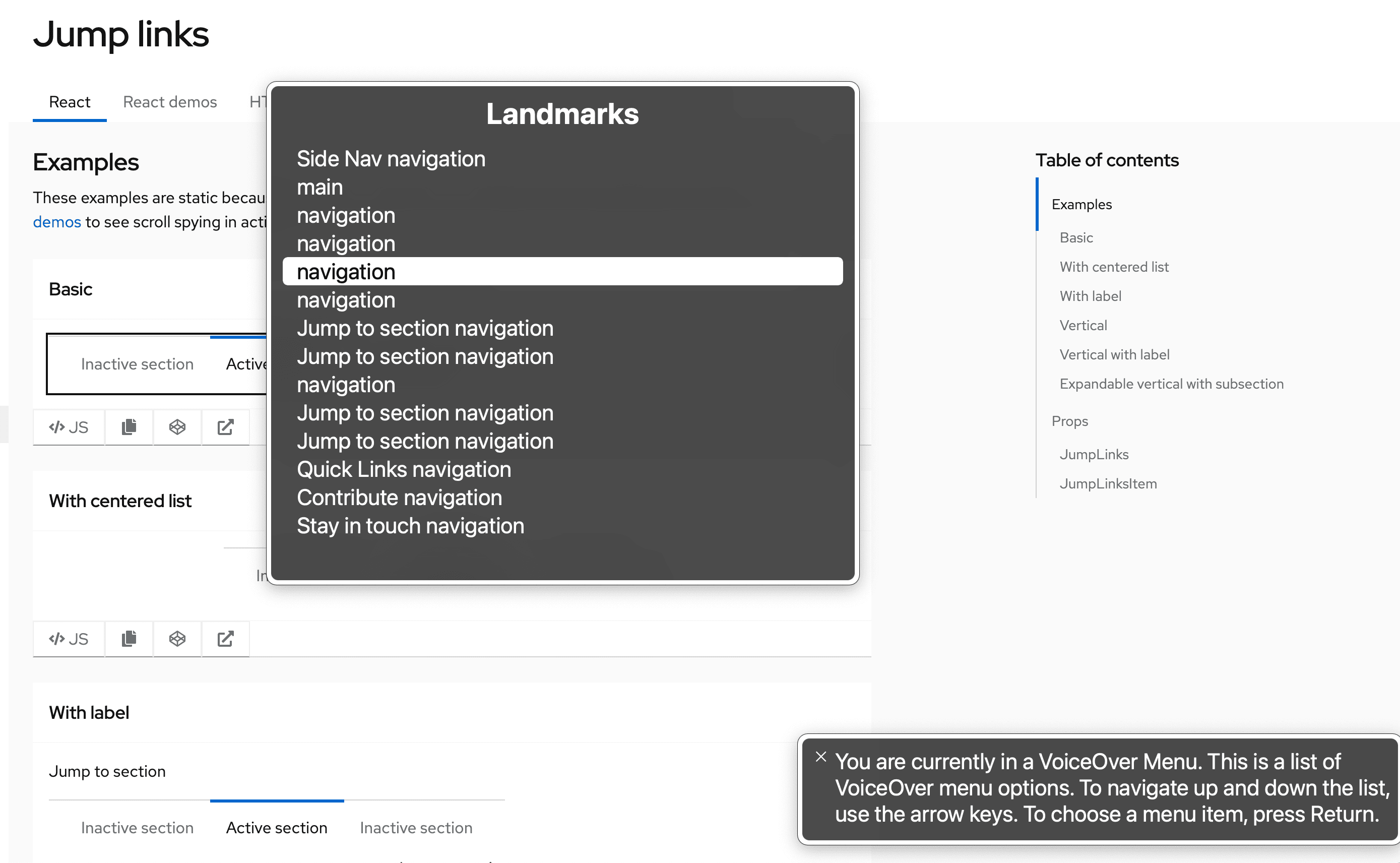
Unique nav labeling
Whenever multiple navigation elements are present on a page, an aria-label is highly recommended. Users navigating via assistive technologies such as a screen reader may be using an elements list or rotor menu to navigate the page, and will be unable to distinguish between the various navigation elements without a unique accessible name.
The following image demonstrates the lack of information presented in VoiceOver's rotor menu when an aria-label is not present nor unique:
View source on GitHub
