A sparkline is a small chart that helps users analyze data and understand trends and patterns.
Usage
Sparklines are commonly used in tables, reports, and dashboards. A common use case is displaying utilization in an environment over time. Sparklines help to show trends in a series of values or to highlight maximum and minimum values. We recommend using sparklines alone without an axis and placing the name of the item being visualized underneath the chart.
Example
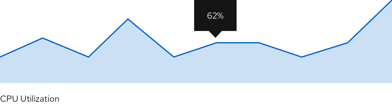
We recommend showing sparklines without an x or y-axis. Depending on space, a label can be placed underneath or to the left of the sparkline naming its visualized item.
View source on GitHub