
React fundamentals
PatternFly React is made up of components, layouts, and demos. The PatternFly React library provides a collection of React components used to build interfaces with consistent markup, styling, and behavior.
To become familiar with building UIs with PatternFly, you will build a PatternFly card. A card is a flexible element for containing any type of content. Cards are used on dashboards, in data displays, or for positioning content on a page.
Step 1. Consider and evaluate the design
Consider the design in Figure 1 and evaluate which components and subcomponents compose the design.
Figure 1
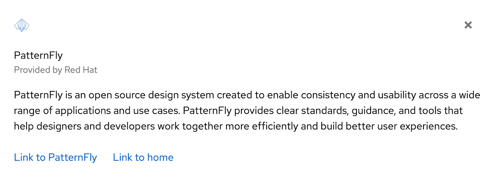
Figure 1 is a design using PatternFly's card component. To learn more, read the documentation for a card's React implementation and the HTML structure.
In PatternFly, subcomponents compose the various regions of a card so its structure is flexible enough to accommodate a range of designs. For example, a card can contain 1 or more of its various subcomponents such as CardHeader, CardHeaderMain, CardActions, or CardTitle.
In this exercise, create a card to match the design in figure 1 with an image, close action, header, body, and footer.
Figure 2
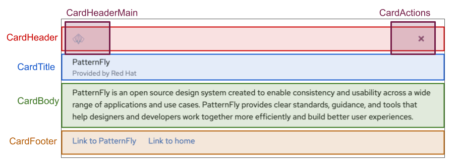
The design in Figure 1 can be broken down into the card’s various subcomponents, as demonstrated in Figure 2. The React components used to construct this card can be arranged, as demonstrated in the card structure code snippet below. You can also view and modify this code in the provided CodeSandbox.
Codesandbox - React fundamentals<Card>
<CardHeader>
<CardHeaderMain></CardHeaderMain>
<CardActions></CardActions>
</CardHeader>
<CardTitle></CardTitle>
<CardBody></CardBody>
<CardFooter></CardFooter>
</Card>Step 2. Build out the CardHeader
The CardHeader contains CardHeaderMain and CardActions.
Step 2.1
Add a brand component to the CardHeaderMain component to place a product logotype on a screen. All that is needed is the source image or SVG and alt text. Here the PatternFly logo is used.
<Brand
  src="https://pf4.patternfly.org/assets/images/pf-logo-small.svg"
  alt="Patternfly Logo"
/>
Step 2.2
Add a close button to the CardActions component. Buttons communicate and trigger actions a user can take in an application or website. They come in several variants, such as primary, secondary, tertiary, danger, plain, link, and control.
Add a button using the plain variant.
<Button variant="plain"> </Button>Step 2.3
Add an icon inside the button. PatternFly React provides a variety of icons. They're easy to use and compile into SVG files. Use them inside buttons and other components.
Add a TimesIcon so that the card can be closed.
<TimesIcon />Step 3. Build out the CardTitle
Step 3.1
Add the text component with a variant inside of the <CardTitle>. The text component can wrap any static HTML content that is placed on the page to provide correct formatting when using standard HTML tags. The text component comes in several variations, such as h1, p, a, small, blockquote, and pre.
Use the ‘p’ variation, which is specified with component={TextVariants.p}.
Add the following code inside the CardTitle component:
<Text component={TextVariants.p}>
  PatternFly
</Text>
Step 3.2
Add a subhead below the text added in Step 3.1. TextContent is used to wrap Text components and provides text with extra spacing and styling.
Add the following code inside of the Text component that is inside of the CardTitle:
<TextContent>
  <Text component={TextVariants.small}>
    Provided by Red Hat
  </Text>
</TextContent>
Step 4. Add content to the CardBody component
Any filler text can be added as a child of the CardBody component.
Step 5. Add content and a layout to the CardFooter
Step 5.1
Add a split layout to the CardFooter component.
PatternFly offers several layout options, including grid, bullseye, and split layouts.
Use a split layout to separate a pair of buttons in the footer of the card. The split layout is designed to position items horizontally. Add a <SplitItem> component inside <Split> for each item in the layout.
<Split>
  <SplitItem>
  </SplitItem>
  <SplitItem>
  </SplitItem>
</Split>
Step 5.2
Add a button to the first SplitItem component. Use the link variant of the button and add an isInline property so that the buttons are inline rather than block elements.
<Button variant="link" isInline>Link to PatternFly</Button>Step 5.3
Add a button to the second SplitItem component. Use the same variant and properties as Step 5.2.
<Button variant="link" isInline>Link to home</Button>Step 5.4
Add a hasGutter property to the Split component to add more spacing between the buttons. The Split component should look like this with the hasGutter property set.
<Split hasGutter >Compare your results
A fully constructed card can be viewed and modified in the CodeSandbox solution. Compare your work with the solution.
Codesandbox solution - React fundamentalsView source on GitHub
