Info alert:Beta feature
Use a hero at the top of a home page or landing page to introduce a clear value proposition and primary call to action.
Elements
A hero is a compositional container. Structure content with PatternFly typography and button components inside the hero body.
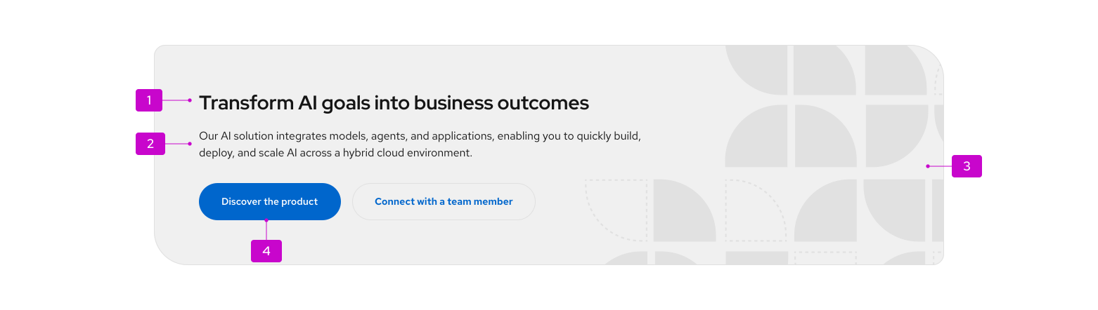
- Headline: A concise statement about the offering or page purpose. Use heading XL typography (28px, Red Hat Display Medium). On a landing page, this should typically be the page
h1. - Description: Supporting context for the headline. Use body large typography (16px).
- Visual content (optional): A right-aligned brand asset applied as a background image. Decorative assets should support the message without competing with text.
- Call to action(s): Include at least one primary action; one secondary or tertiary action is optional. Use CTA buttons at size
lg.
Usage
When to use
Use a hero when the primary purpose of the page is to:
- Establish brand tone and communicate a key value proposition.
- Introduce a new product, feature, or campaign.
- Drive users toward a specific high-value action or conversion.
Common placements include home pages, product landing pages, and main dashboard landing views (such as Compass).
When not to use
Do not use a hero as a generic page header on:
- Pages focused on content discovery, data management, or dense workflows (use a standard page header instead).
- Detail views, settings pages, or views where the user's primary task is utility- or task-driven rather than conversion-oriented.
For in-page promotional content that is not at the top of the view, use a hint or horizontal split card instead.
Placement
- Place the hero at the top of the page content area, spanning the full content width.
- Do not place a hero in the middle or bottom of a page.
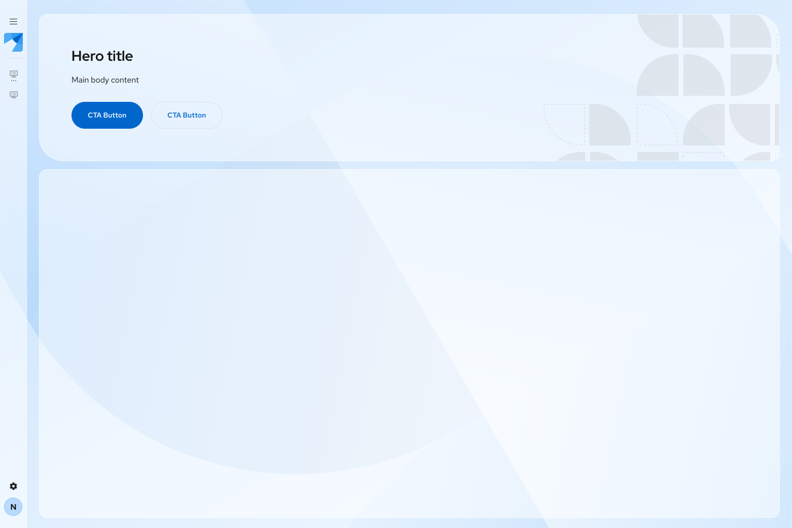
- In Compass or layered layouts, place a Glass hero directly over the page background—not inside a Panel (
.pf-v6-c-panel), or within.pf-v6-c-compass__main-headeror.pf-v6-c-compass__content. - Constrain text content with the hero body defaults (
bodyWidth800px,bodyMaxWidth80%) so copy stays on the left and does not collide with a right-aligned background asset.
Variants
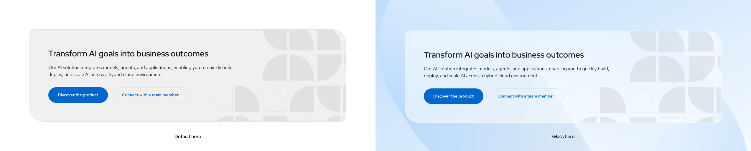
Default
Use by default on standard landing pages. Default heroes use asymmetric corner radii to reflect Red Hat brand styling (16px on the start-start and end-end corners; 48px on the start-end and end-start corners) and uniform 64px padding to draw attention.
Glass
Use in glass theme contexts—especially Compass and generative UI layouts—when the hero sits directly over a background image rather than within a standard page section.
Glass styling requires both:
- The glass theme (
.pf-v6-theme-glass) on the<html>element - The glass variant (
isGlassin React, or.pf-m-glassin HTML/CSS) on the hero component
Glass heroes use a translucent background, backdrop blur, and the glass box shadow token.
Note: Compact, expandable, and dismissable variants are in design review and will be documented once implemented.
Content considerations
Write hero content that is clear, concise, and action-oriented:
Element | Guidance |
|---|---|
Headline | 1 short sentence. Lead with the core user benefit. Use sentence case. |
Description | 1–2 sentences maximum. Add essential context without repeating the headline. |
Primary CTA | Start with an action verb. Be specific ("Start free trial," not "Click here"). |
Secondary CTA | Use for a lower-commitment or supporting action ("Learn more," "View documentation"). |
- CTA limit: Use a maximum of 2 buttons. If more links are needed, put them in the description or in the page body below the hero.
- For voice and tone, follow brand voice and tone. Hero copy should feel informative and supportive.
Visual content and responsive behavior
Brand assets
- Apply visual assets as a background image (not a separate image slot). Position on the right, aligned to right-center (
background-position: right center,background-size: contain). - Ensure sufficient contrast between text and any part of the background the text might sit over.
- Provide distinct light- and dark-theme asset variants when using background imagery (
backgroundSrcLight/backgroundSrcDarkin React).
Responsive behavior
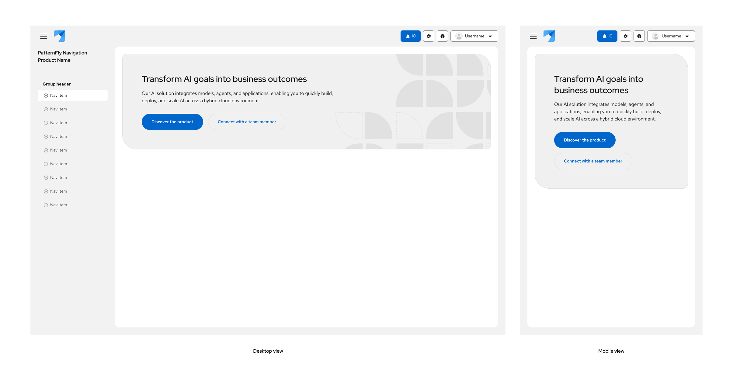
- Keep the headline and description left-aligned within the hero body so they do not overlap the right-hand brand asset.
- On mobile and narrow viewports, omit or override the background image so content can stack cleanly. Hero does not hide the background asset automatically at small breakpoints.
- Call-to-action buttons may wrap to a second row on narrow viewports.
Gradients and backgrounds
When using gradient overlays or background images, verify color contrast in both light and dark themes. If you remove the background asset, adjust bodyWidth and bodyMaxWidth as needed so text still reads well at large viewport sizes.
Spacing and typography reference
Hero container
Spec / Element | Value | Token |
|---|---|---|
Padding | 64px (all sides) | --pf-t--global--spacer--3xl |
Body width | 800px | --pf-v6-c-hero__body--Width |
Body max width | 80% | --pf-v6-c-hero__body--MaxWidth |
Border radius (small corners) | 16px | --pf-t--global--border--radius--medium |
Border radius (large corners) | 48px | Custom value (no global token) |
Default background | Tertiary fill | --pf-t--global--background--color--tertiary--default |
Glass background | Glass primary | --pf-t--global--background--color--glass--primary--default |
Glass shadow | Glass default | --pf-t--global--box-shadow--glass--default |
Recommended composition
These gaps come from nested content components (Content, Flex, ActionList), not from .pf-v6-c-hero itself:
Spec / Element | Recommended value | Token |
|---|---|---|
Headline | Heading XL (28px / ~36.4px line-height) | --pf-t--global--font--size--heading--xl |
Body | Body large (16px / 24px line-height) | --pf-t--global--font--size--body--lg |
Headline → description gap | 16px | --pf-t--global--spacer--md |
Content → CTAs gap | 32px | --pf-t--global--spacer--xl |
CTA gap | 16px between buttons | --pf-t--global--spacer--gap--action-to-action--default |